Reform Dumbo
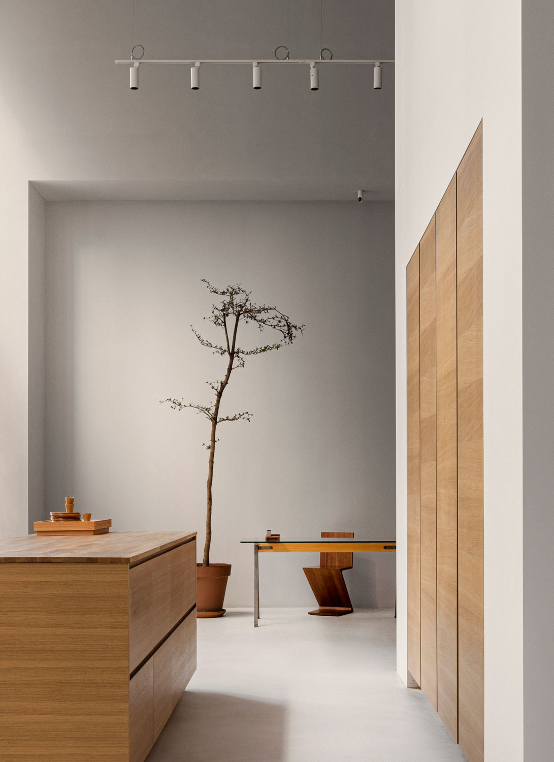
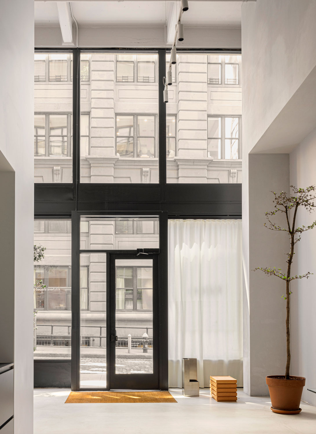
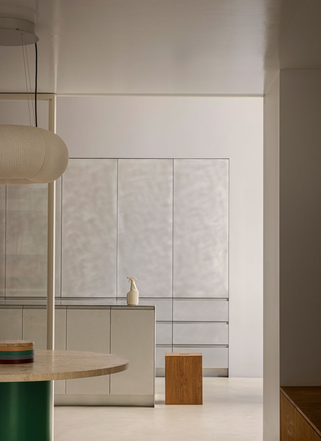
The Reform showroom in Dumbo, NY, is more than a display space; it is a branded environment that balances grandeur with coherence, allowing customers to focus on each unique kitchen design.
Location
New York, US
Photography
Jonas Bjerre-Poulsen
Category
Commercial
Year
2024
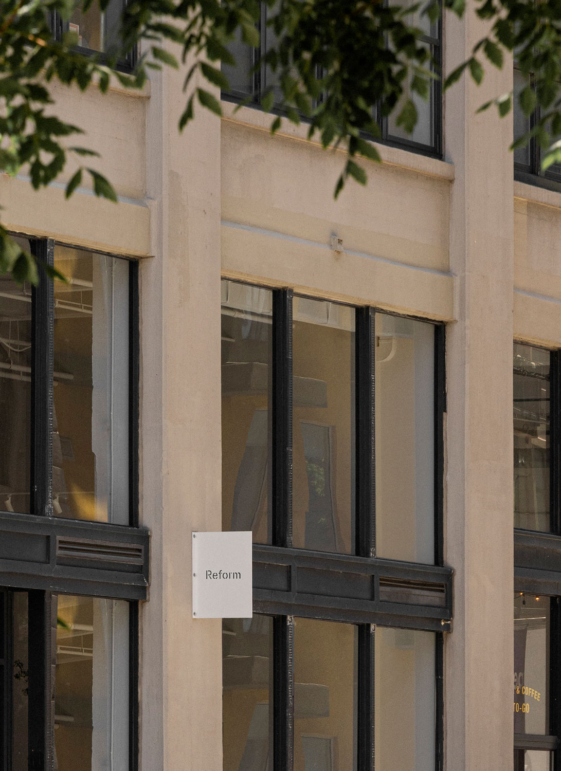
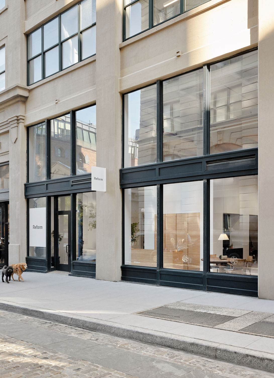
Located in New York City’s dynamic Dumbo neighborhood, the Reform showroom finds its home between the iconic Brooklyn and Manhattan Bridges. Surrounded by a blend of lush greenery and historic industrial architecture, this space artfully balances grandeur with a warm, inviting atmosphere.
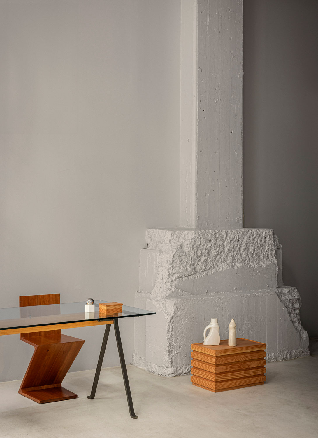
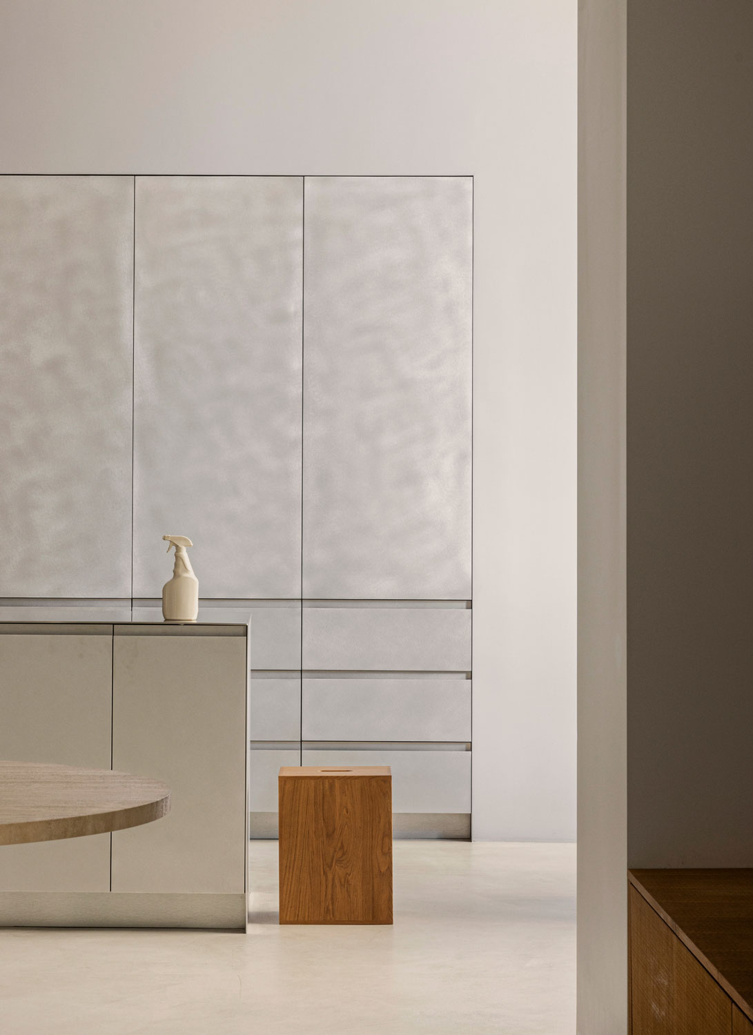
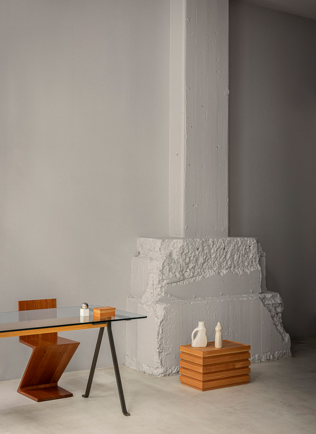
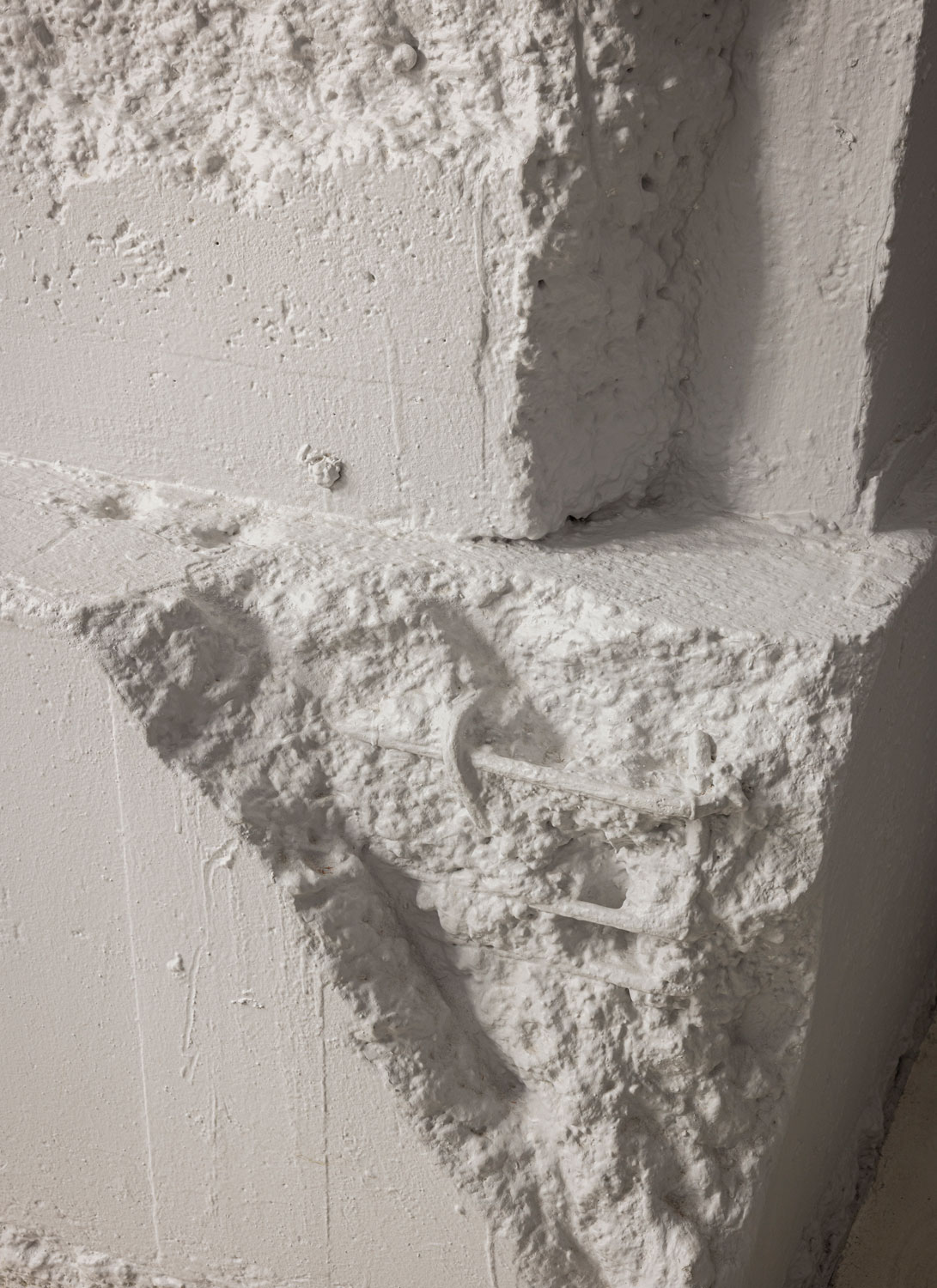
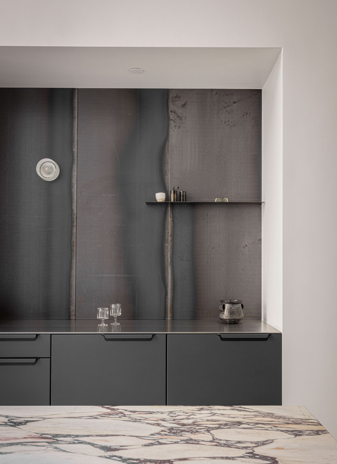
The design, inspired by the city’s iconic monuments, uses monochrome surfaces as a canvas, allowing each kitchen to tell its own story and inspiring visitors to imagine their own dream spaces.

Dumbo’s well-known creative and foward-thinking atmosphere made it the ideal fit for Reform to showcase a Scandinavian approach to kitchen design.
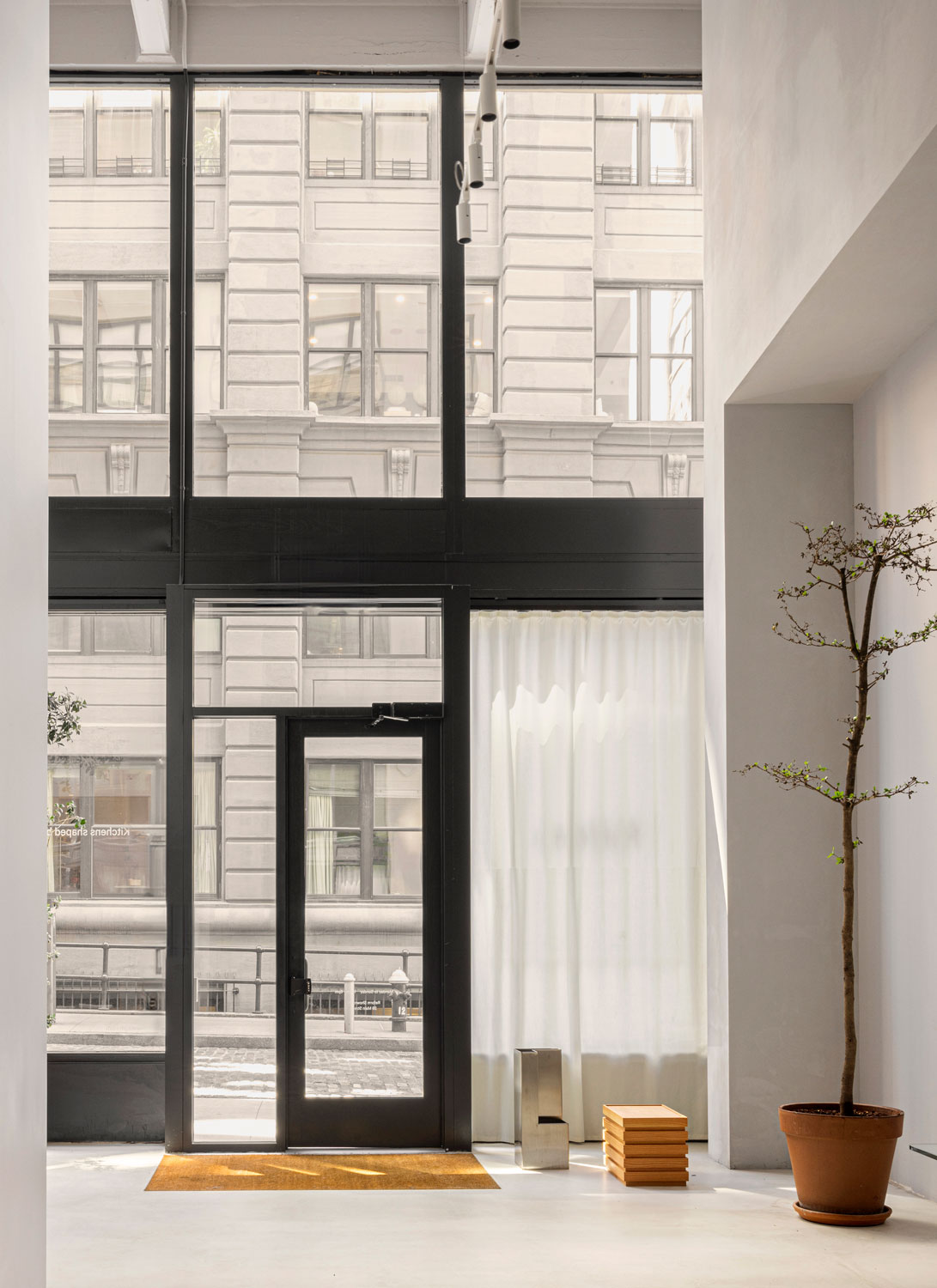
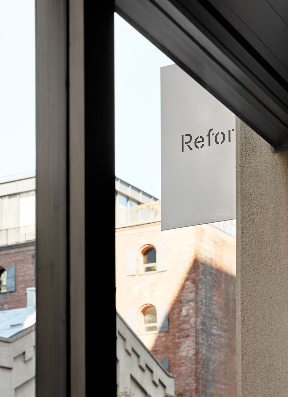
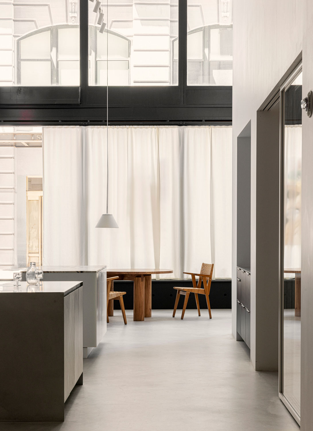

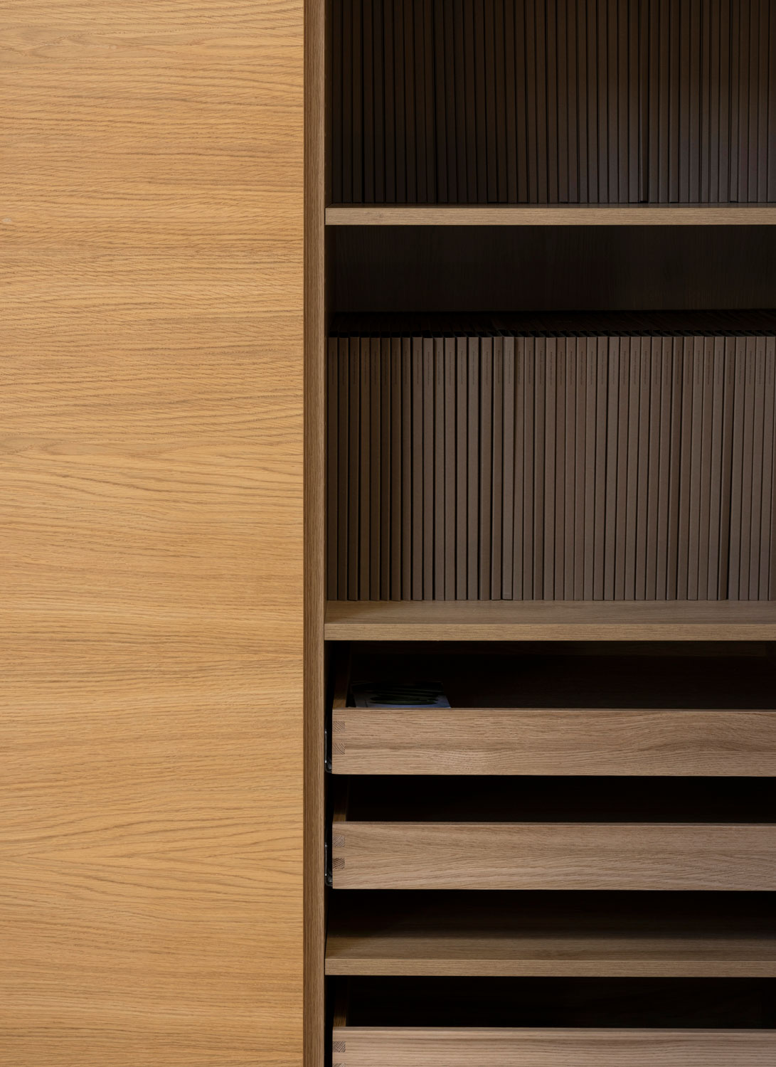
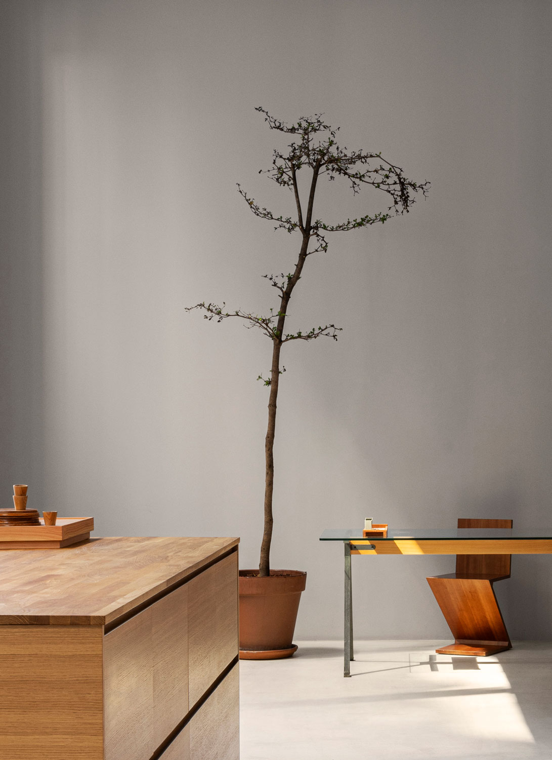
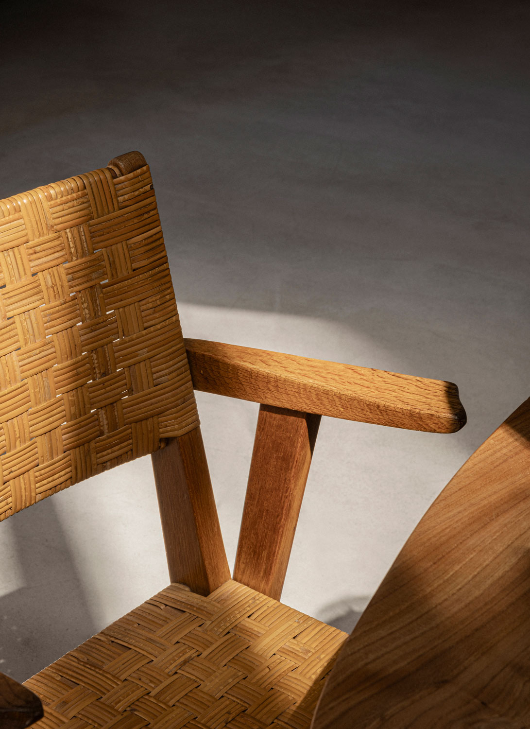
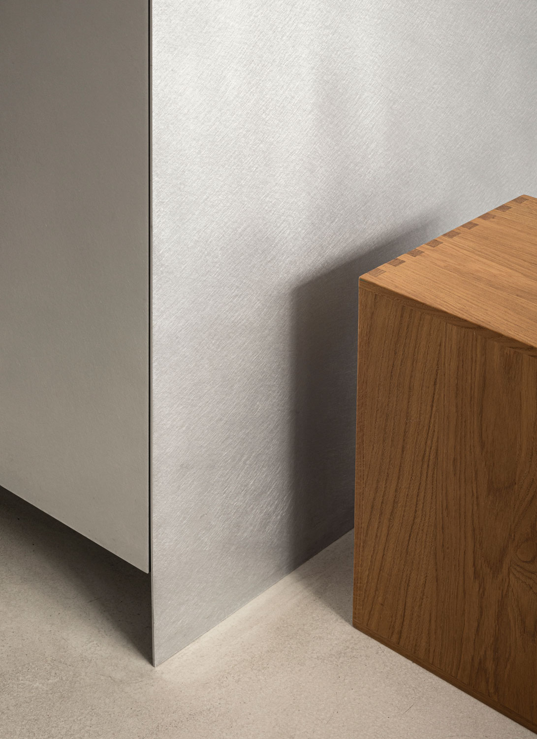
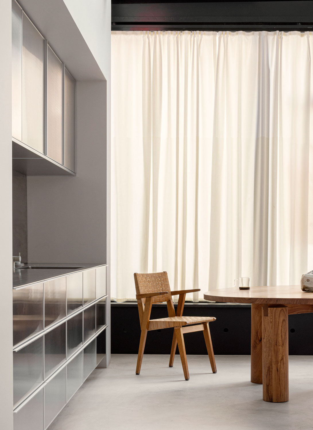
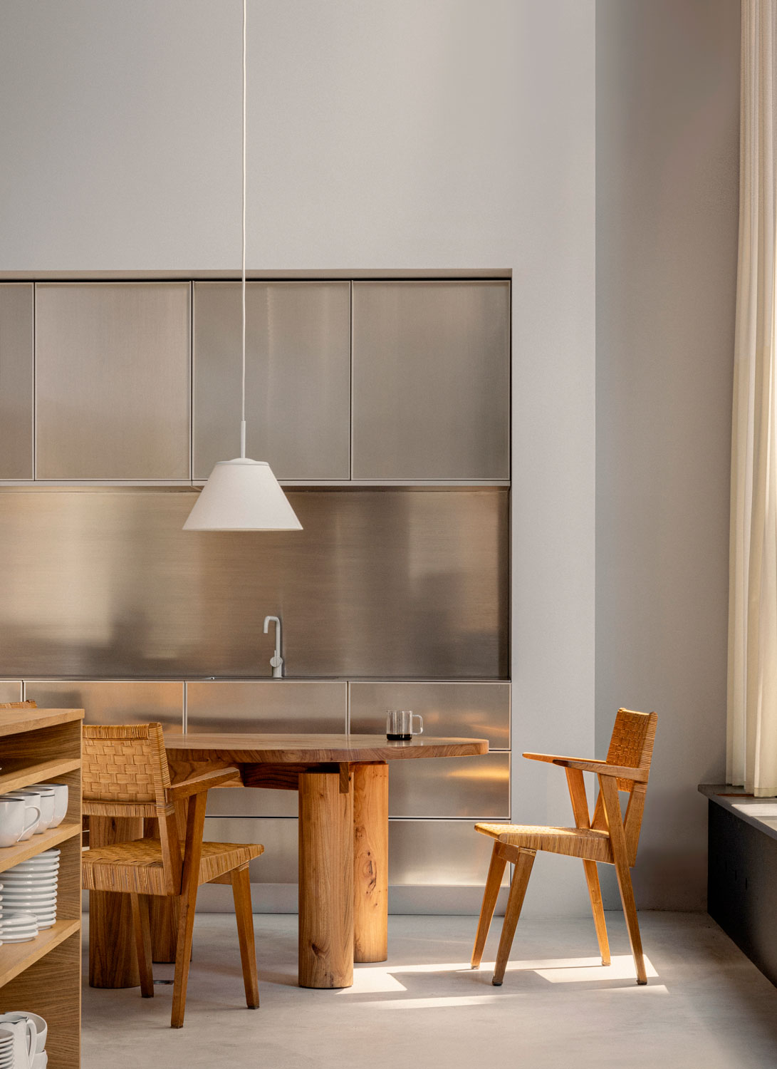
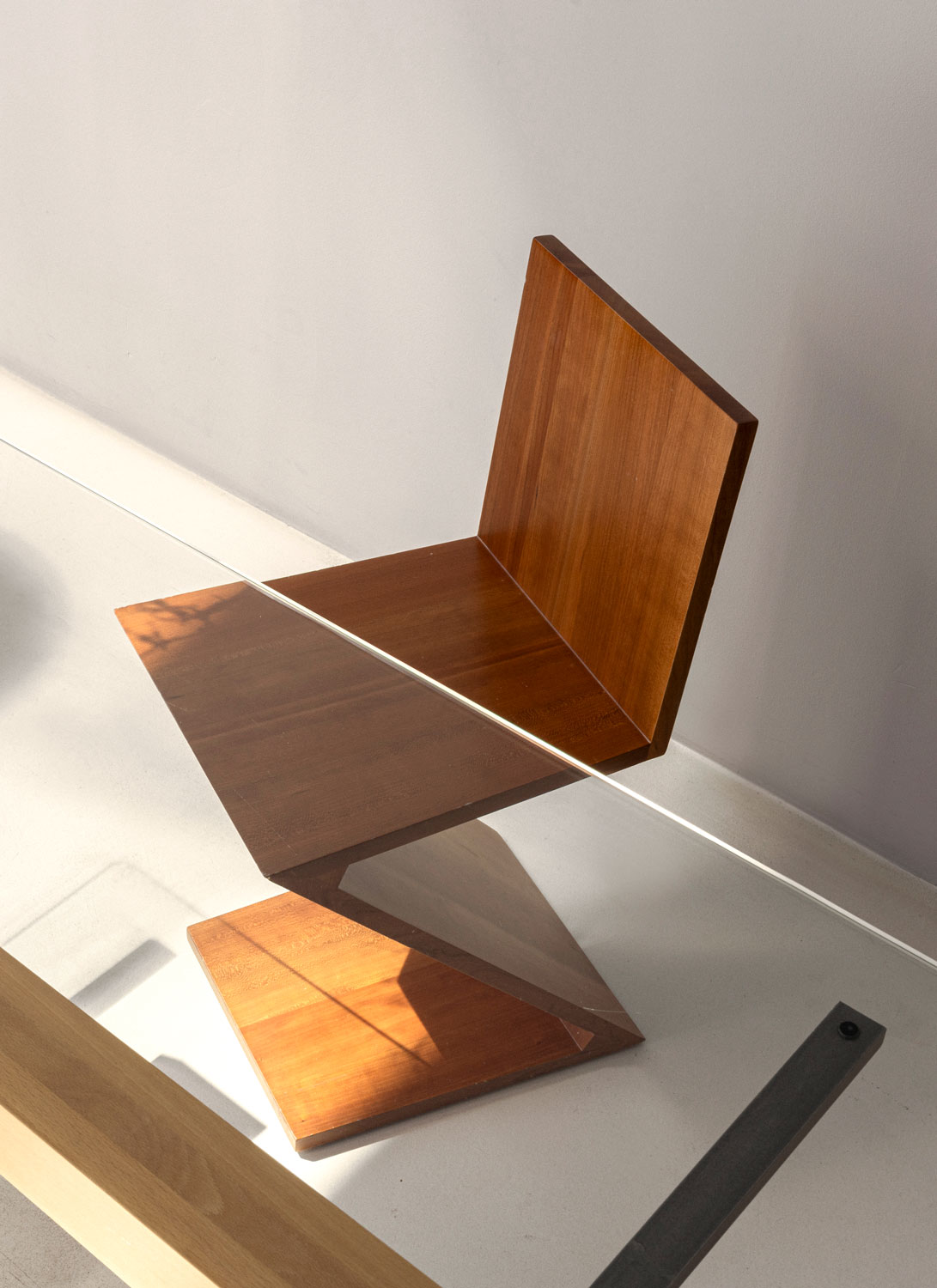
To complement the raw space, we introduced tactile warmth and softness through the use of natural materials and carefully selected colors, ensuring that the environment exudes a welcoming and inviting atmosphere.
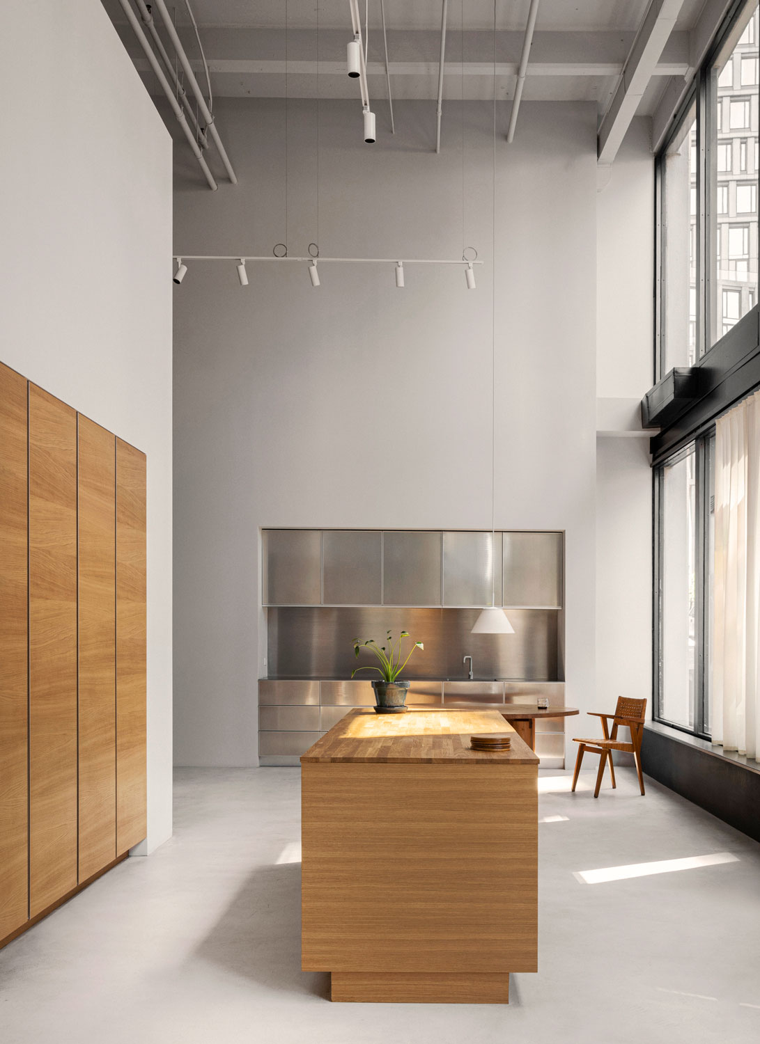
Drawing inspiration from the grandeur of the building itself – marked by high ceilings and an industrial aesthetic – a tactile warmth was introduced to the raw and spacious environment through carefully selected materials, creating an inviting atmosphere.
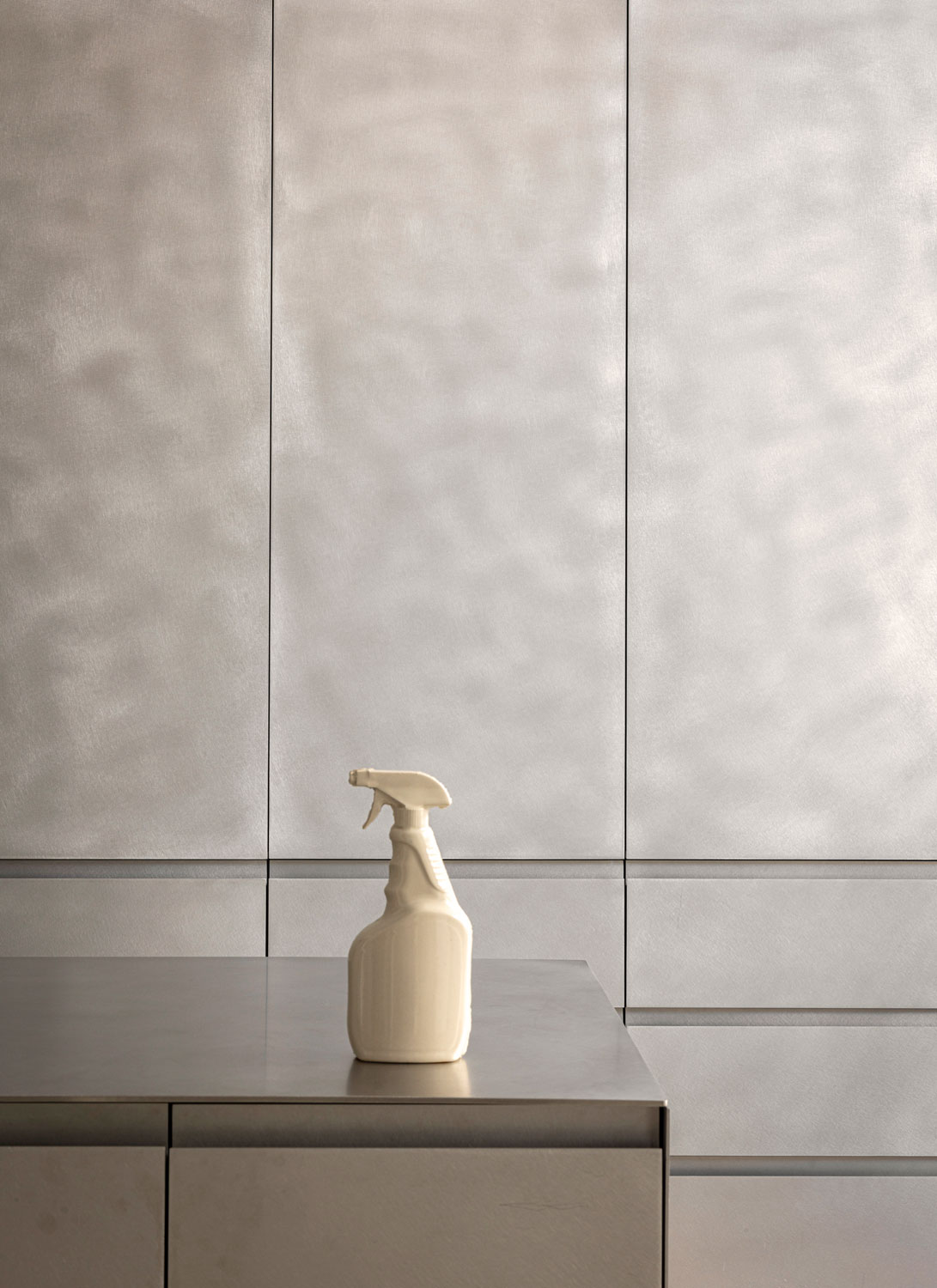
Still, the monochrome surfaces of the space, inspired by the city’s monumental architecture, serve as a neutral backdrop that lets each kitchen tell its own story, inspiring personal dreams, and aspirations.
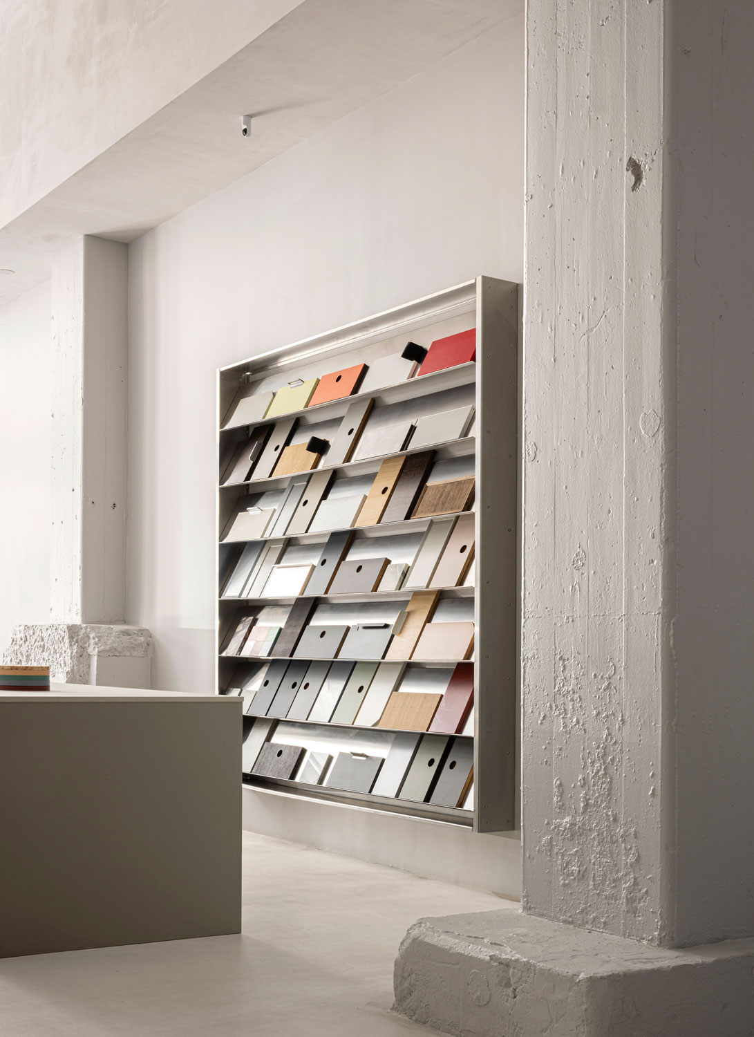
More than a showroom, this curated space not only showcases Reform’s ever-growing collection but also accommodates the evolving needs of events and office functions, making it a dynamic platform for the brand’s future growth.
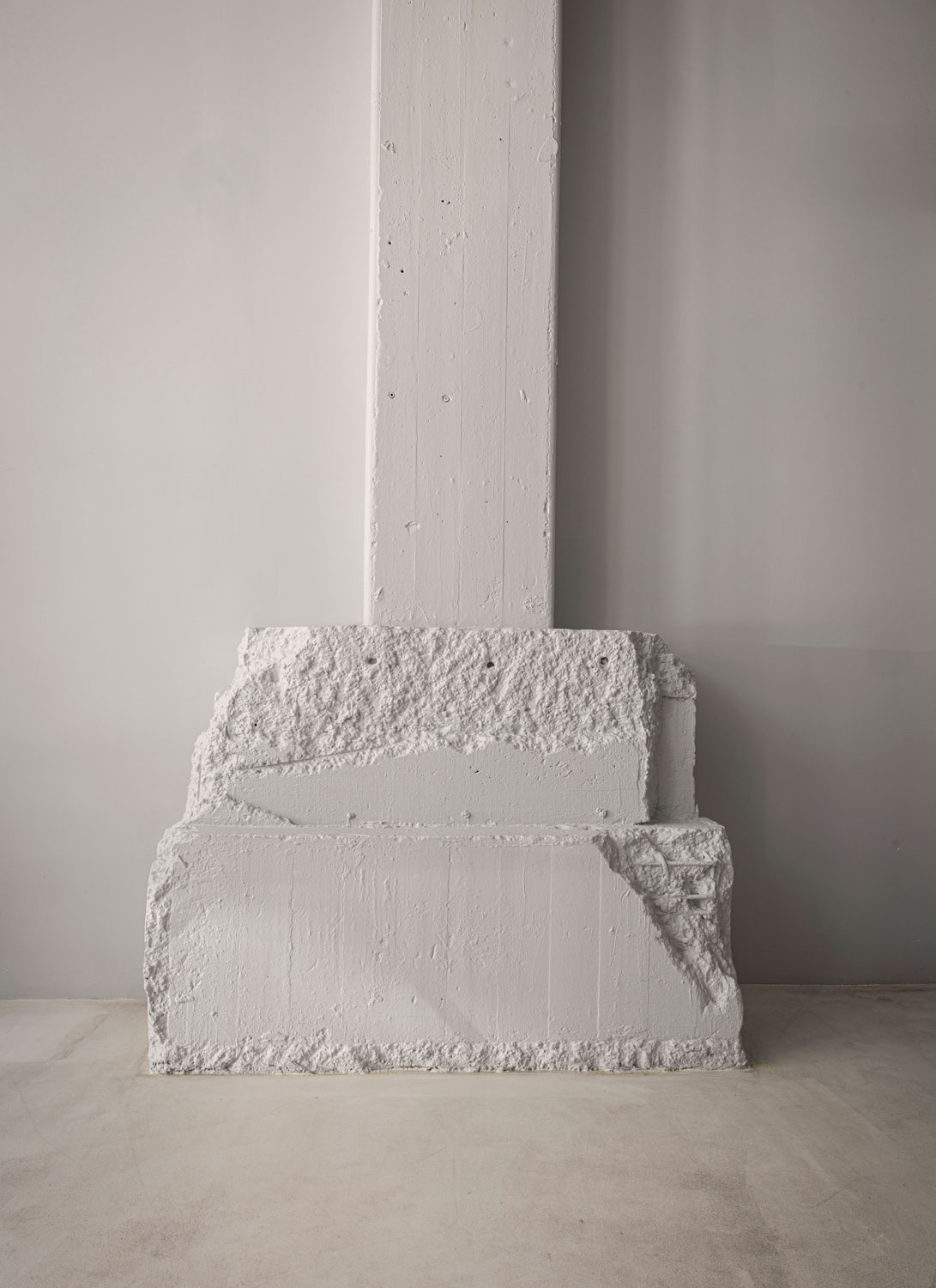
With a focus on symmetry and clean, bold expressions, the space presents a thoughtful reinterpretation of a monolith, transforming the traditional notion of a singular and imposing structure into a dynamic and innovative element. This modern reimagining retains the monolith’s inherent sense of unity and presence but adapts it to better integrate with the space and its surroundings.
By reworking its form and function, the reinterpretation adds a new layer of accessibility and engagement, blending the monolith’s powerful presence with a more contemporary and approachable design that caters to the needs of both staff and customers – a central and cohesive feature that resonates with the showroom’s modern aesthetic and anchors the overall design.
The overall layout encourages exploration, with the integrated kitchens revealing themselves progressively as one moves around the monolith. A central meeting room doubles as a passageway, enhancing the flow and creating a sense of openness.
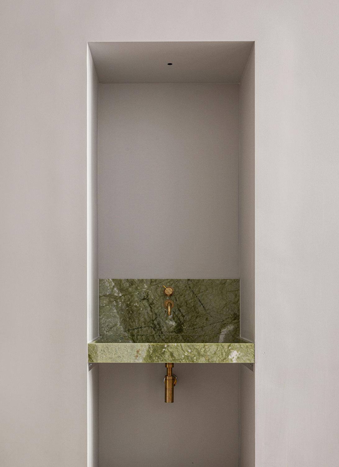
Vast vertical surfaces and monochrome installations dominate the environment, creating a striking yet harmonious atmosphere. This blend of innovation and coherence ensures that, despite the grand scale, the showroom allows customers to focus on each design.


In each room, a seamless division between the lounge area and bedroom is achieved with strategically placed wooden louvers, striking a balance between transparency and privacy, while also transforming filtered light into enchanting wall art, eliminating the need for additional decor. This way of filtering daylight adds a magical touch, resulting in rooms that evolve and captivate throughout the day. Whether the light reflects off the dolomite plaster ceilings or the wooden cladding, the atmosphere undergoes a mesmerizing transformation. The interplay of light, creating dynamic triangles or softly filtering through the natural fibres of draping, ensures each experience is uniquely varied.
The lighting scenarios of artificial light sources to compliment daylight are also crucial for the atmosphere and comfort. In a collaborative effort with Anker&Co, we have ensured a calm ambiance where the illumination seemingly disappears – we didn’t want to create anything too dramatic to compete with the breathtaking nature outside. Instead, the soft lighting accentuates the tactile nature of the space.
“
The showroom draws inspiration from the building’s inherent grandeur, with its soaring ceilings and industrial aesthetic.
– Norm Architects
Kitchens are inhabited by people and personalities. No two homes are alike, and each new space comes with its own range of needs. Therefore, Reform has made it their mission to offer a wide range of modern, people-centered design solutions that cater to the changing demands of their customers.
This commitment to flexibility and personalization mirrors our own approach at Norm Architects, where we prioritize creating spaces that are not only aesthetically pleasing but also deeply responsive to the individual needs of the user. Our shared values in human-centered design and our commitment to quality, functionality, and aesthetic harmony make our collaboration a natural fit, with each project reflecting a deep understanding of the diverse ways people live and interact with their surroundings.
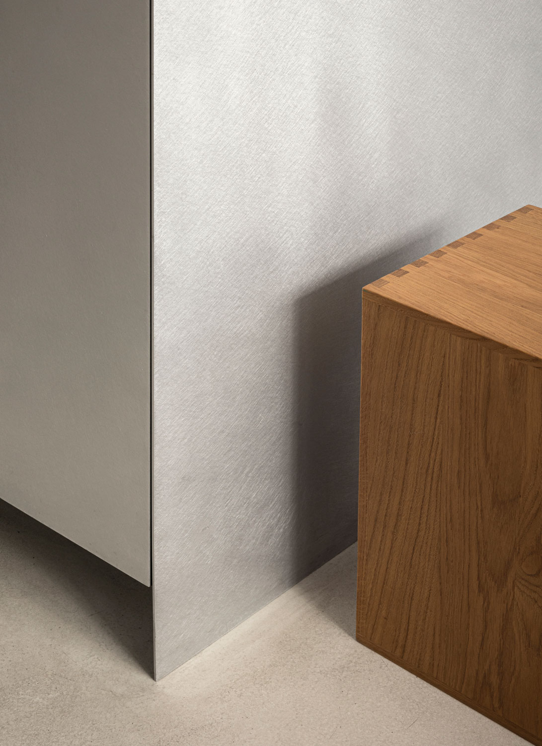
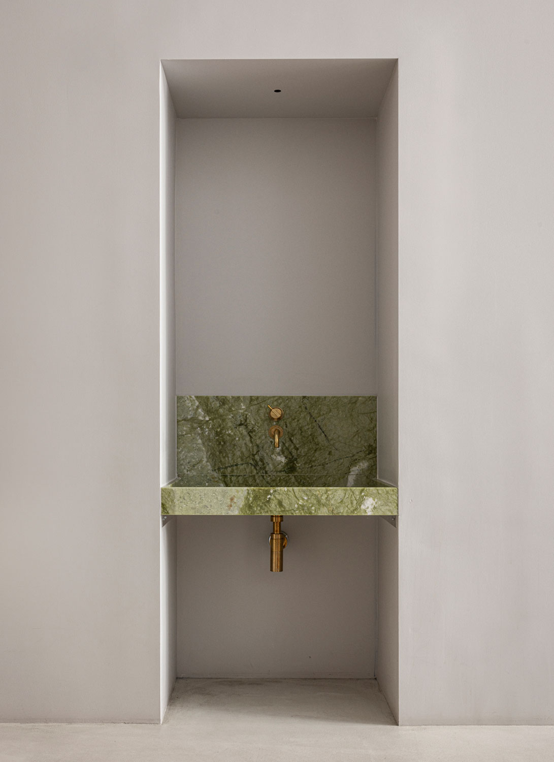
The contemporary approach to architectural details, colors, and materials gives you a sense of the unexpected.
