Waterfront House
Location
North of Copenhagen, Denmark
Photography
Jonas Bjerre-Poulsen
Category
Residential
Year
2022
Being an early modernist structure, the Waterfront House originally combined stucco details with clean lines – not daring to devote itself completely to modernism – resulting in a sort of non-style without direction. We therefore decided to take away the stucco and other redundancies in order to bring out the streamlined qualities within the structure, allowing the house to finally redeem its full minimalist potential.
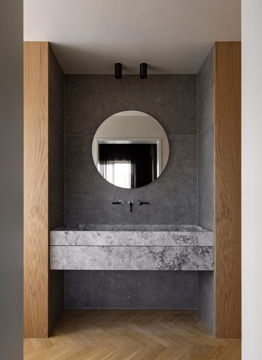
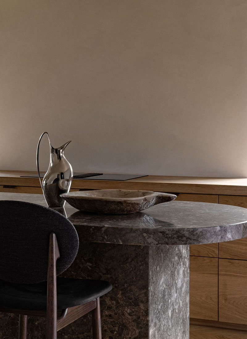
The concept of the internal layout has been changed to create a core in the house. The beautiful kitchen is now the heart of the home around which everything gravitates, creating a natural flow and connection between the different functionalities on the ground floor. Serving as a sort of central axis in the space, the kitchen island is made bespoke in Grigio Belliemi stone asserting a certain solidity. The characteristic stone is moreover repeated in a brushed version by the fireplace, underlining the strong connection in the house.

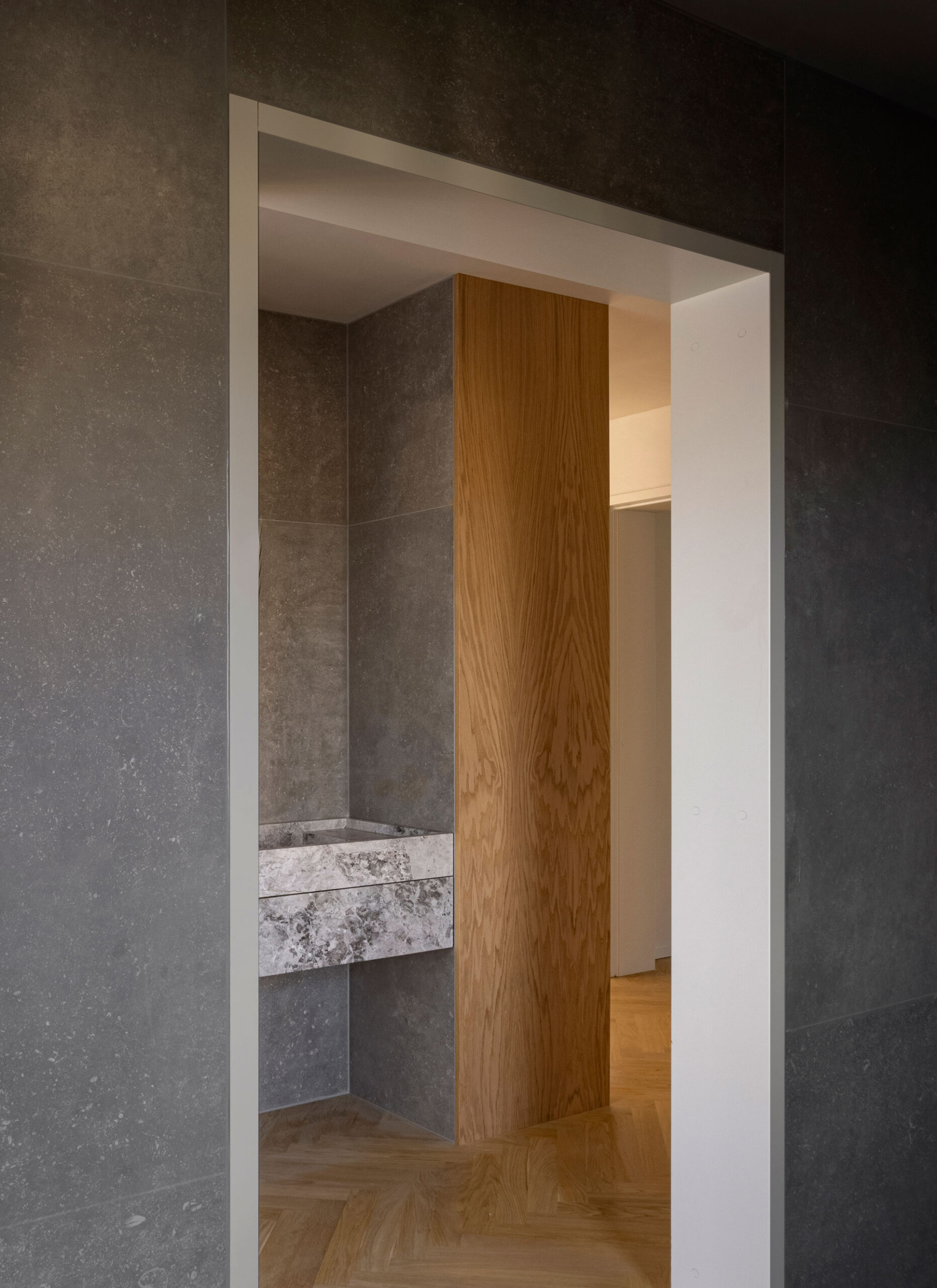
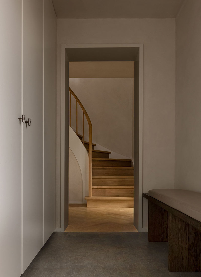
In the hall, storage has been optimized, while clutter is minimized. Creating a calm and tactile atmosphere, the floors has been covered with large dark stone tiles, creating a cave-like sensation.

“
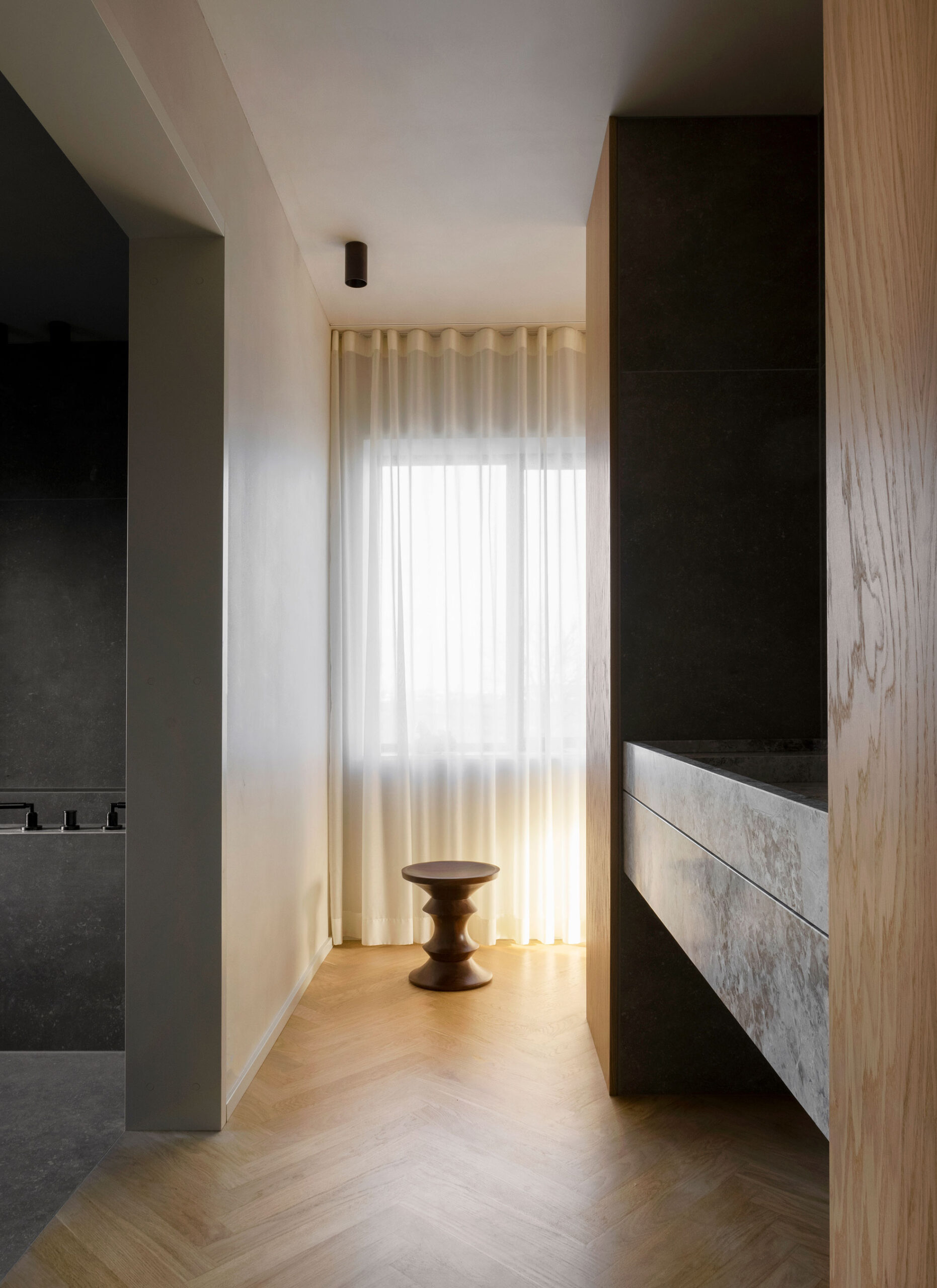
Classical herringbone parquet in oak adds a certain grandiosity to the otherwise minimalist home.
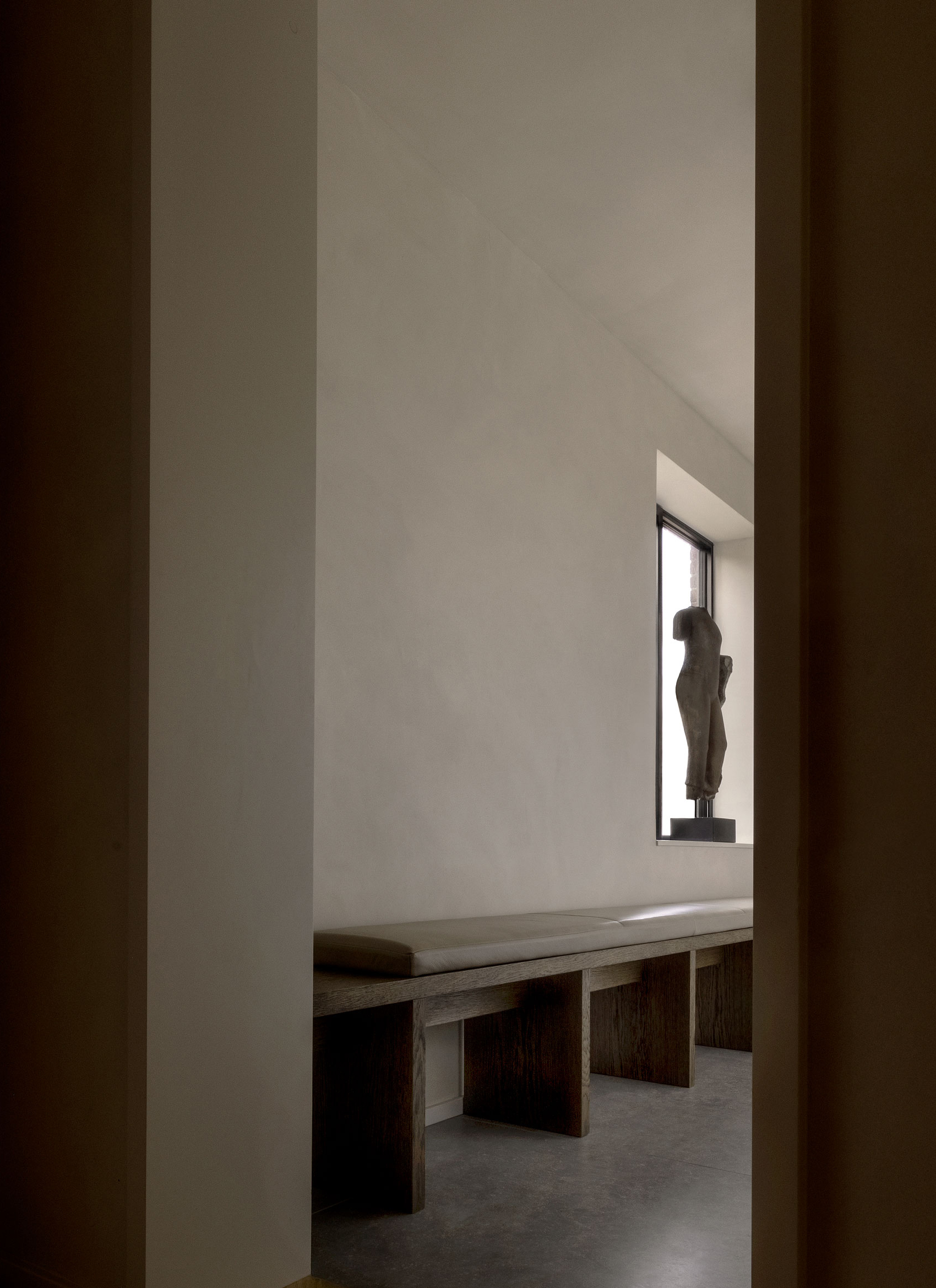
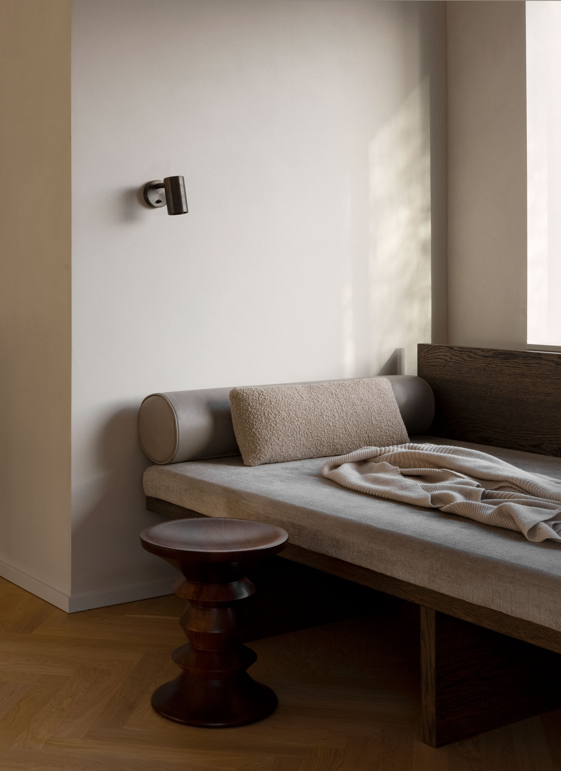
The living room has been divided into different zones with different purposes for the domestic life that is unfolding within the space; the centered sofa arrangement has room for guests and has a cosy view of the fireplace, while the built-in sofa that stretches in the length of the room invites to snuggle up by yourself and read a book or look out over the sea.
With a balanced material palette, the interior plays on the inherent contrasts between the warmth in the applied oak wood and the cold within the elements in marble and stone. Bringing a tactility to the rooms, the walls have been covered with St. Leo paint, drawing in structures from nature.
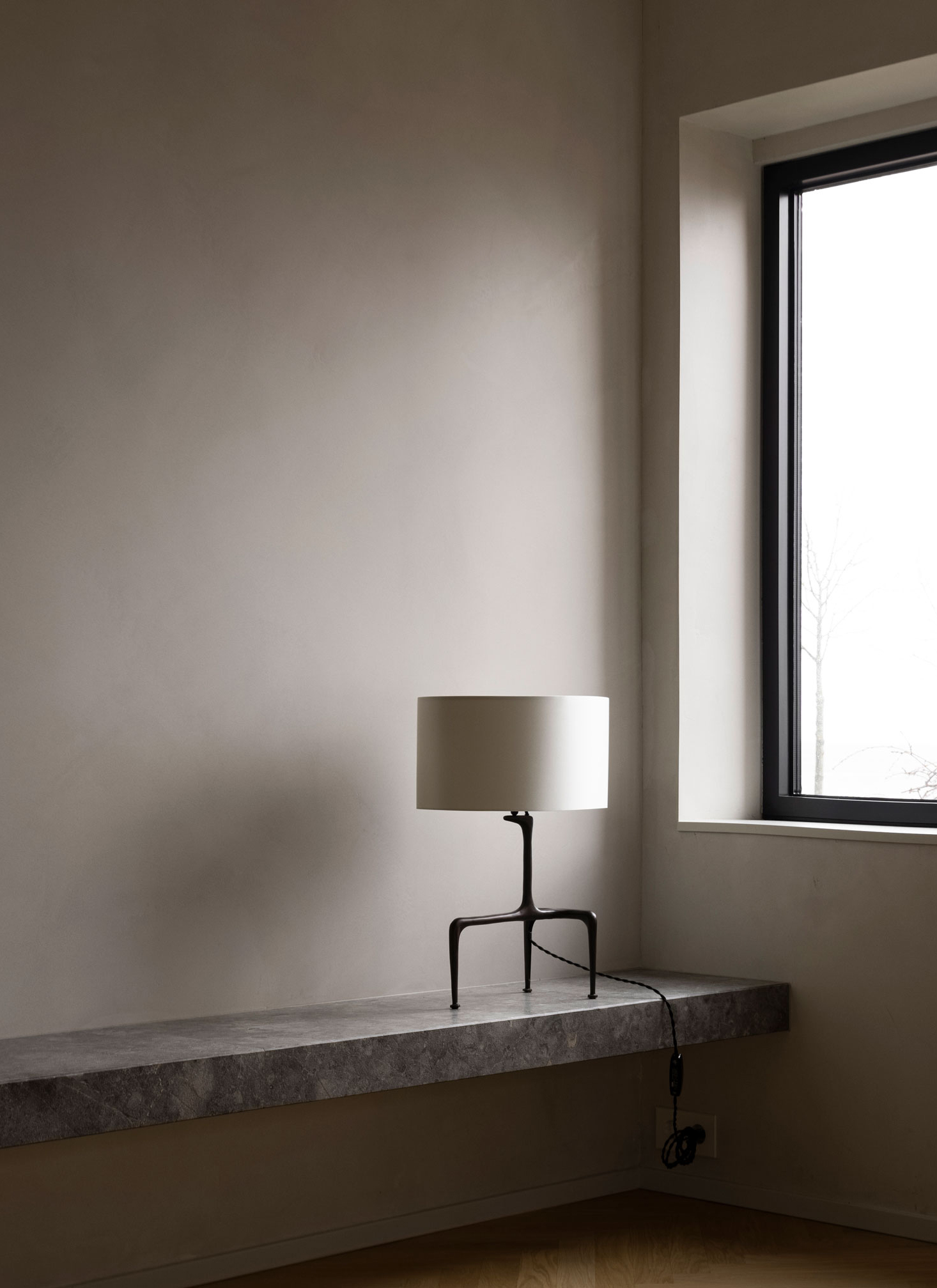
Characteristic details from the original house have either been reconstructed or reinterpreted and turned into contemporary elements suitable for present needs. Hence, the original mullioned windows were replaced with bigger ones with modernist traits, letting in light without breaking up the great view, while the staircase is a duplicate of its predecessor, which was no longer in great shape.
In order to create a strong cohesion within the home, certain elements of the interior have been made bespoke, recognizing that there’s no one-size-fits-all solution and that these tailored compositions are lasting in that they’re not only made to serve their purpose but are also context-aware and well-integrated in the architecture, making them stand out and inflict a certain value to their surroundings.

The entire house has been completed with bespoke interior, creating a calm refuge for the family to retreat to in a world full of stimulation.

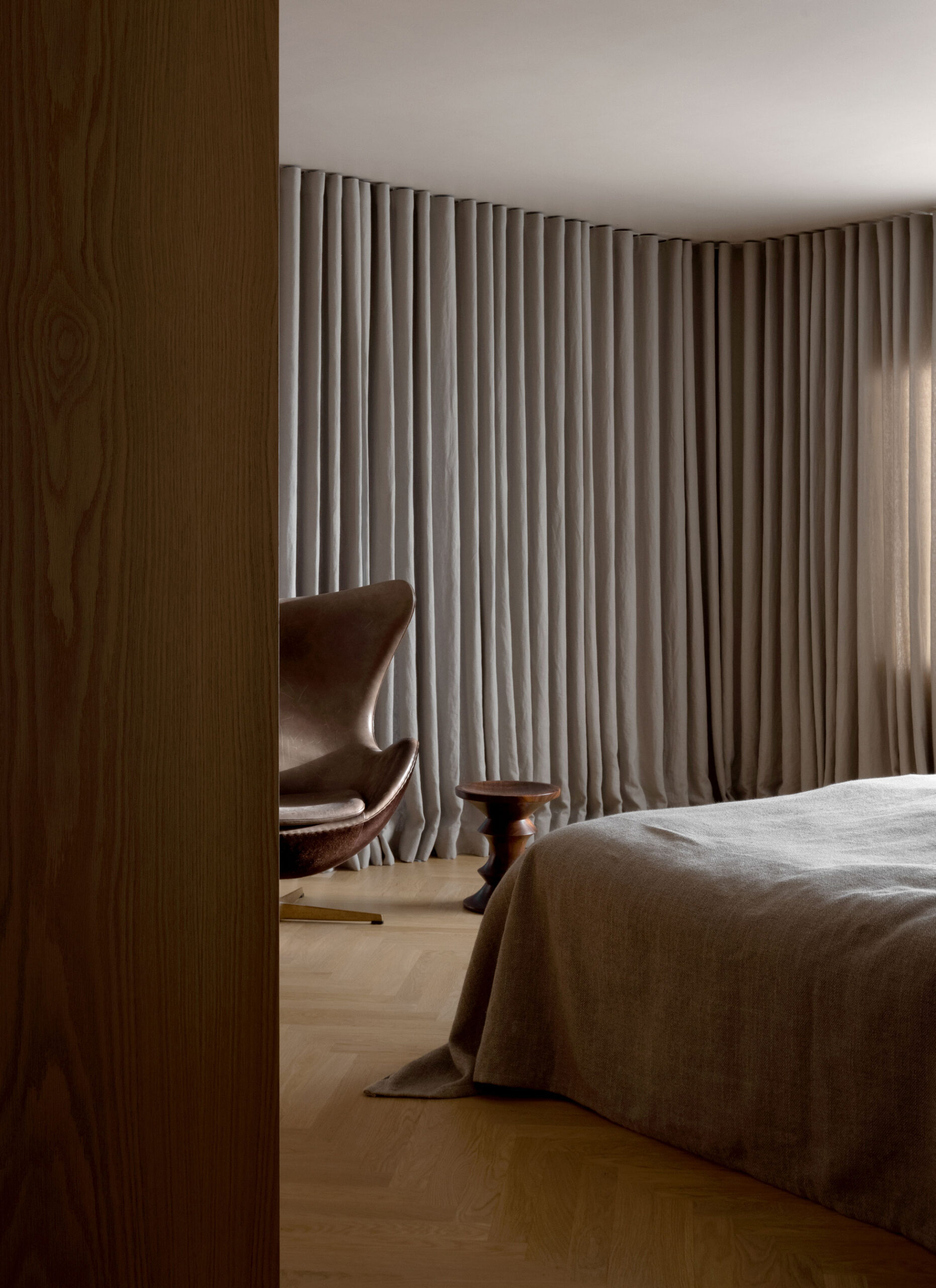
The sense of tactility and softness has been further heightened in the bedrooms, where curtains fold from one end of the room to the other – improving acoustics and creating a calm feeling of refuge.
Besides the modernist characteristics in the choice of windows, detailing on the doors, as well as in the overall geometry, we wanted to also bring our take on Soft Minimalism into play through homey details, soft elements, and tactile surfaces. This way we subtract all the unnecessary clutter, while making sure that the sparse interior won’t ever feel empty or cold.


