Chancery House
History dances with sustainability and modern elegance in the Chancery House workspace for The Office Group in the heart of London’s lively Midtown. The meticulously revitalized nine-story heritage building stands tall as a timeless testament to the city’s enduring charm.
Location
London, UK
Photography
Jonas Bjerre-Poulsen
Category
Commercial
Year
2023
History dances with sustainability and modern elegance in the Chancery House workspace for The Office Group in the heart of London’s lively Midtown. The meticulously revitalized nine-story heritage building stands tall as a timeless testament to the city’s enduring charm. Perched elegantly atop the labyrinthine London Silver Vaults, an underground treasure trove of the city’s rich history, this architectural gem exudes an enchanting fusion of heritage and contemporary design. It’s a place where the subtle whispers of time harmonize with the vibrant energy of today, creating a unique atmosphere. Step inside to discover a palette of colors and materials that reflect the city’s vibrant tapestry, while the essence of the building evokes a sense of serenity, echoing the ever-evolving rhythm of modern life.
Transcending the conventional concept of an office space, Chancery House stands as The Office Group’s most ambitious venture to date – a sprawling 16.000 sqm residence that champions sustainability and boasts a ‘BREEAM Excellent’ certification, placing flexibility and well-being at the forefront of its design.
Working on their ninth project with The Office Group, dMFK Architects have refurbished, reconfigured, and extended the original building, collaborating with Norm Architects to deliver the interior architecture – together demonstrating the possibility and necessity of a comprehensive and aesthetically pleasing approach to the workplace. Rising nine stories high, this architectural site now stands as a testament to the seamless integration of the old and the new, effortlessly fusing heritage with contemporary design.

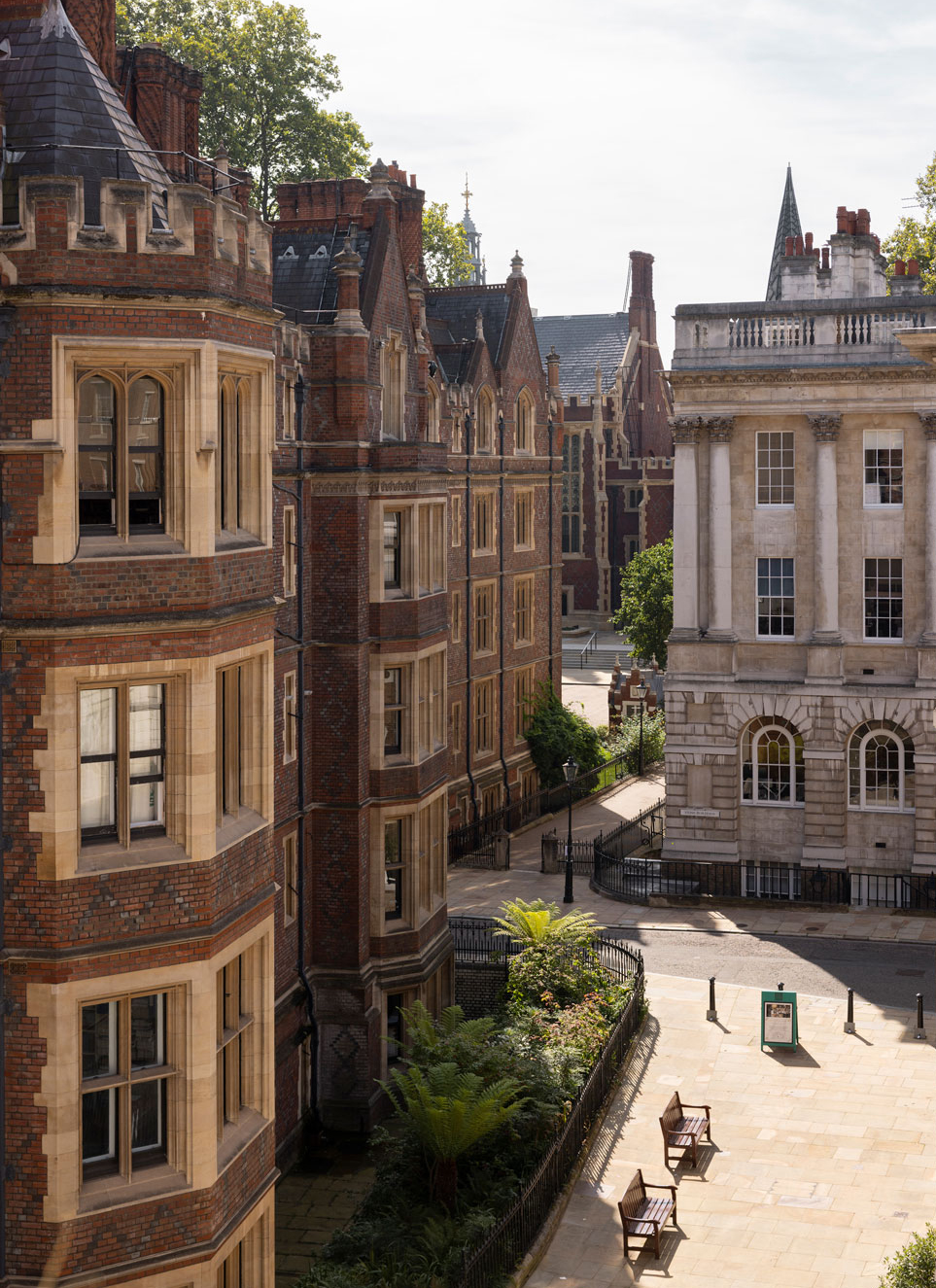
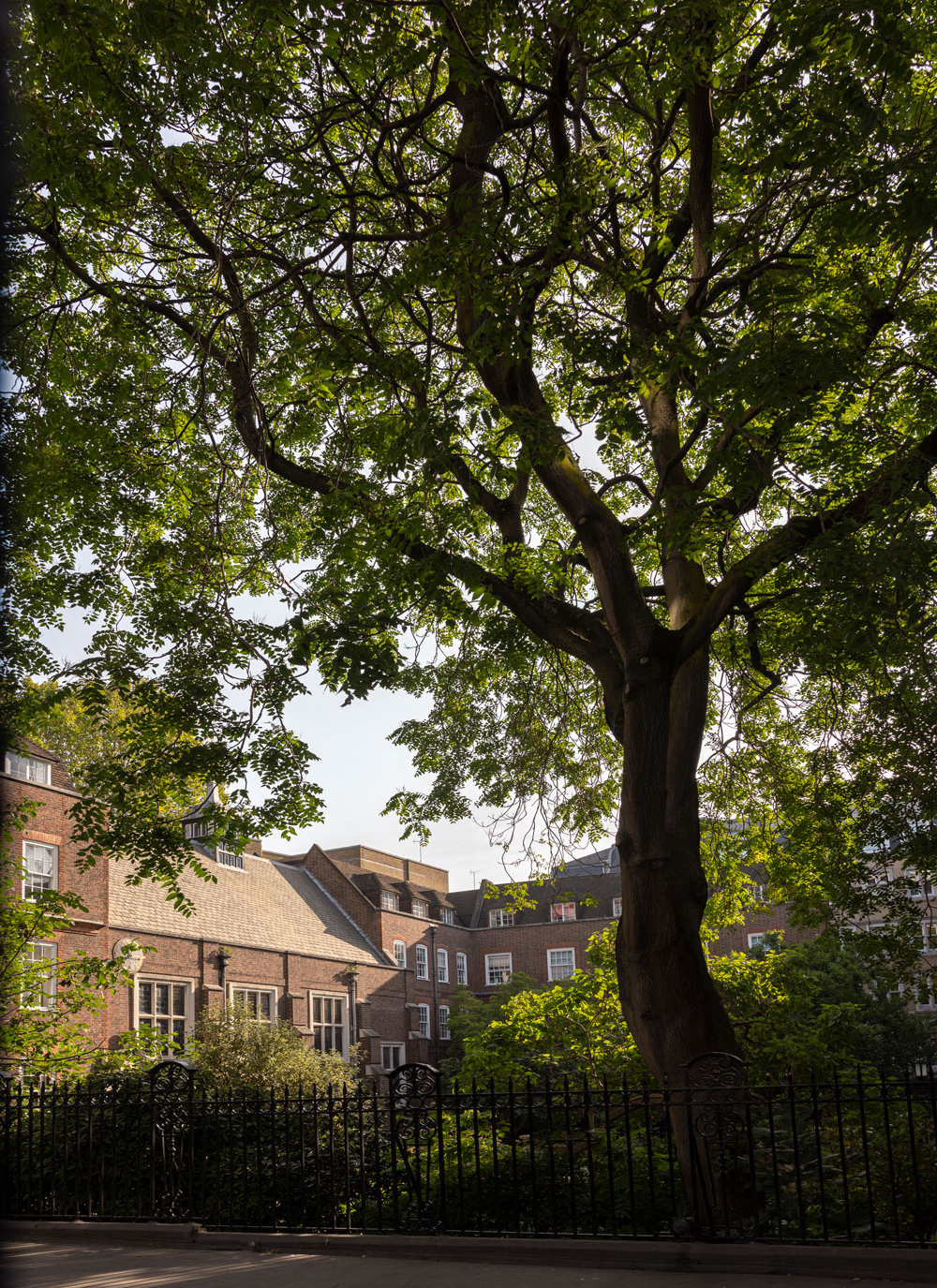
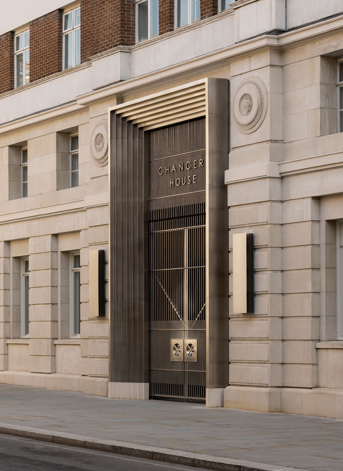

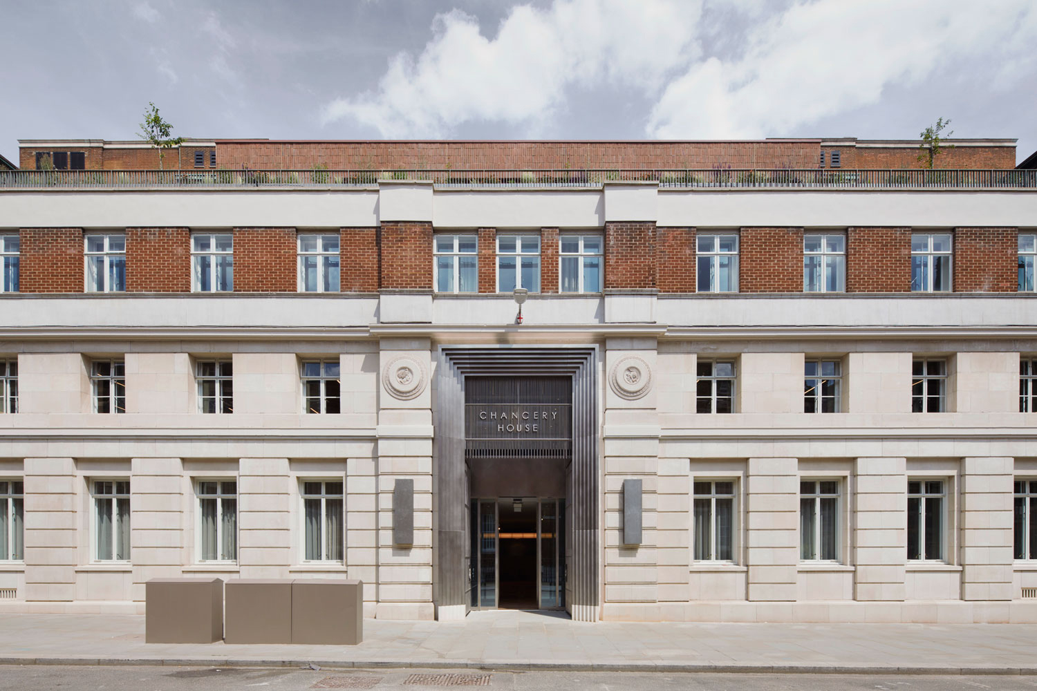
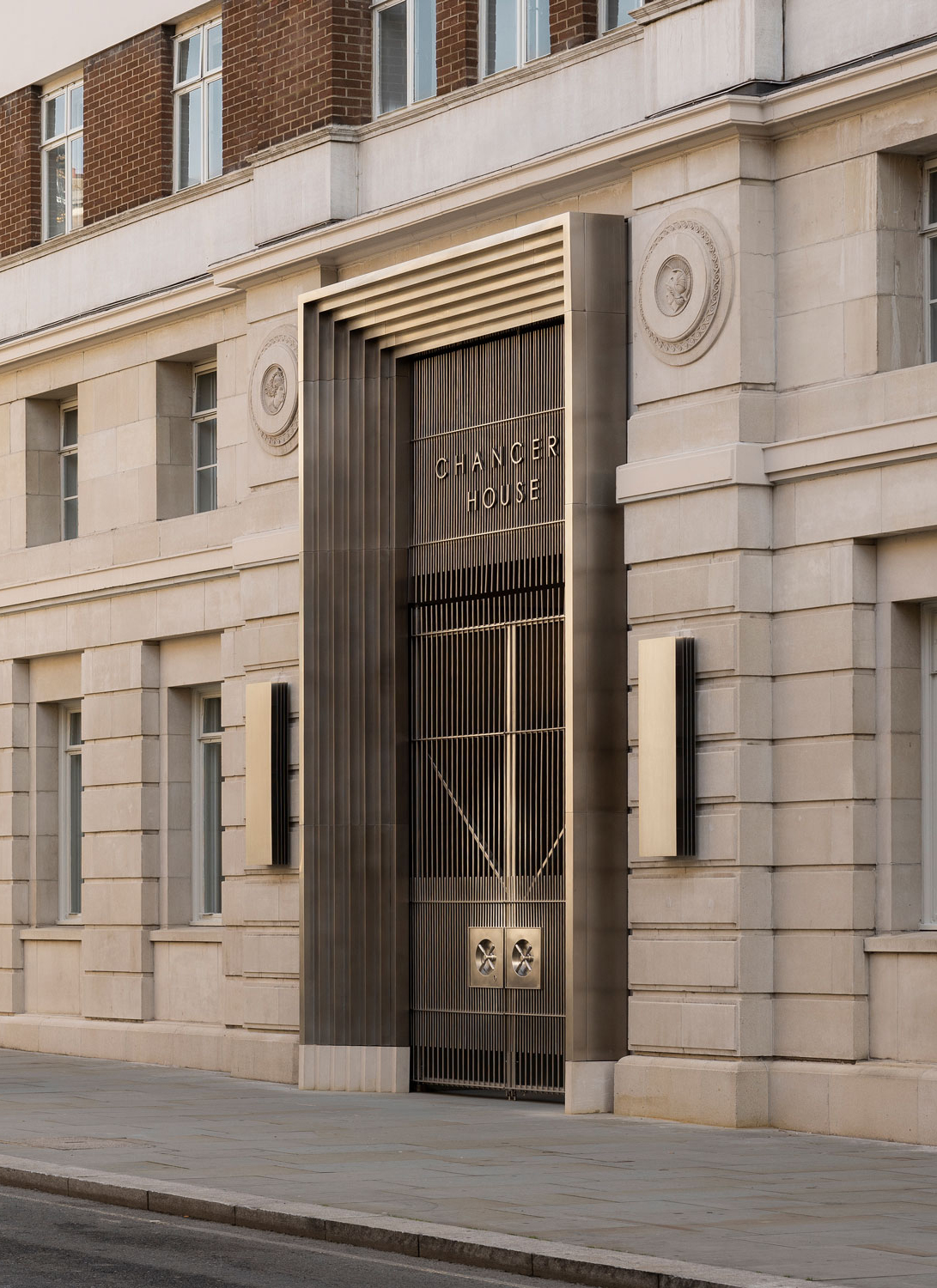
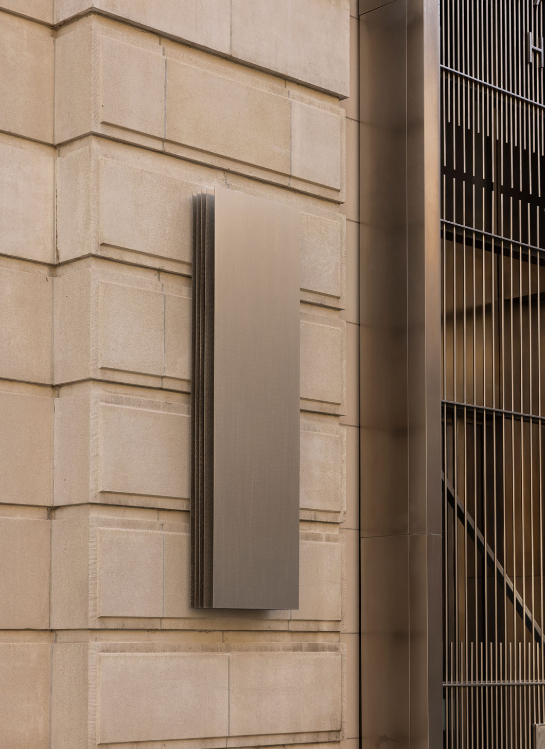
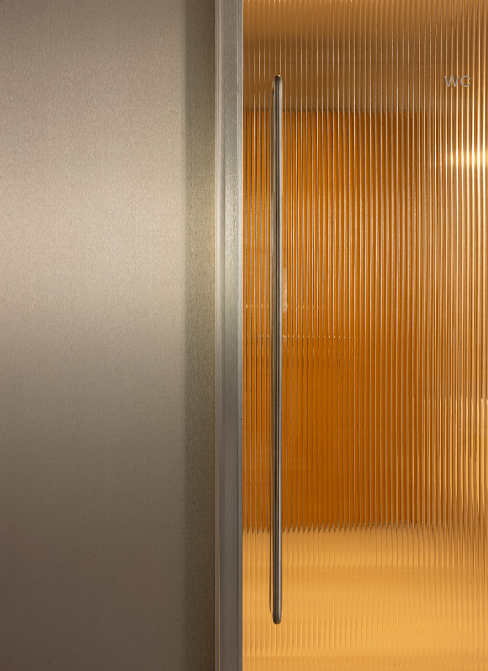
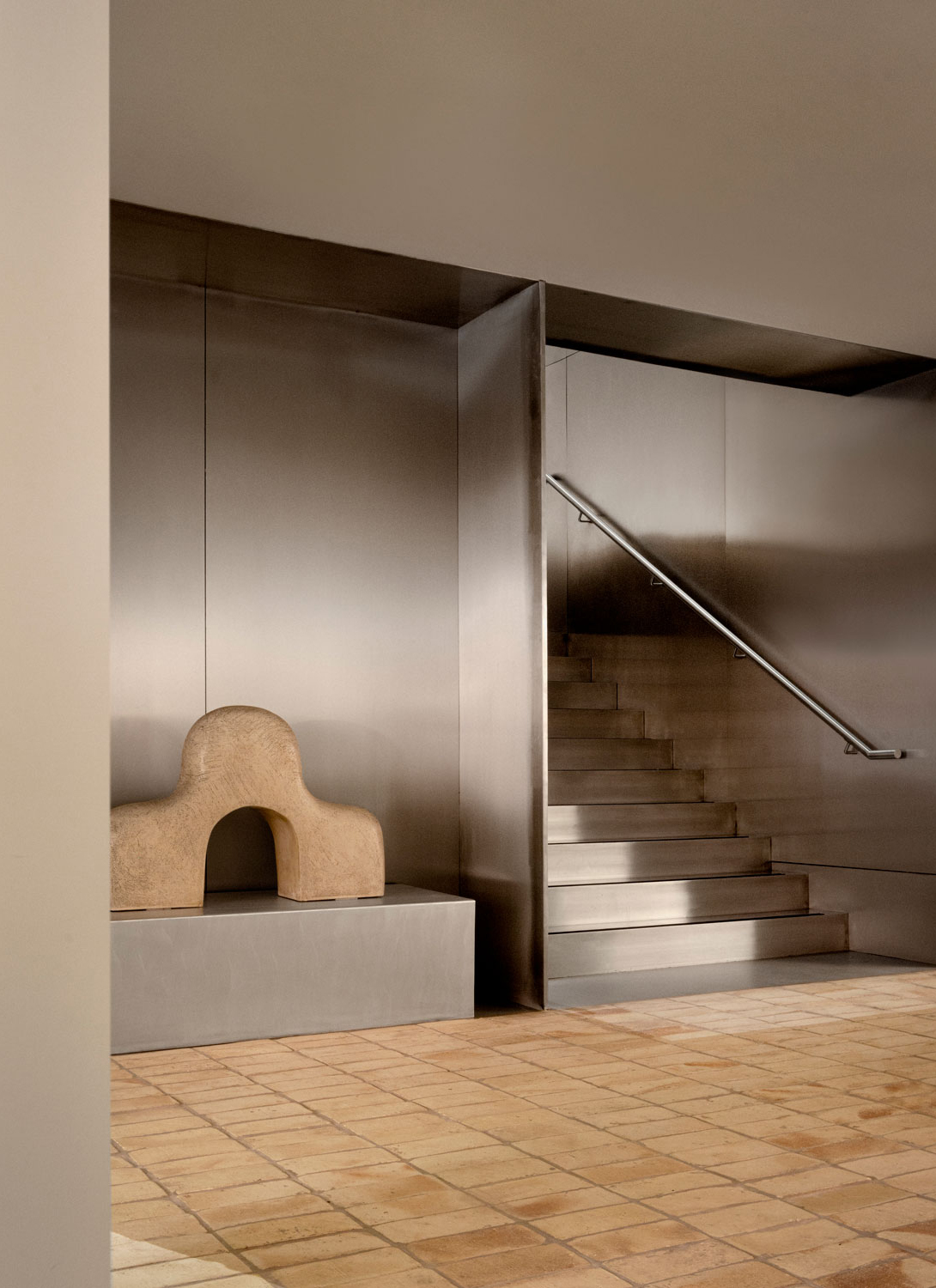
To celebrate the sense of arrival, DMFK Architects created a dramatic double height entrance portal, designed in a stepped stainless steel, inspired by the secure vault doors in the basement of the existing building – home to the London Silver Vaults. A solution that later served as inspiration for different bespoke light fittings designed by Norm, which can be found several places inside and out.
Central to the collective spirit is a shared desire to care for the user, weaving intricate designs that not only engage the senses but also cultivate a serene and inviting ambiance. Our conviction lies in the belief that architects and designers bear a fundamental responsibility: to empower users to thrive – to sculpt a world that revolves around humanity. This entails a profound understanding of the design choices that resonate with the holistic well-being of individuals and extend their positive influence on the broader community and environment. It’s not just about creating spaces; it’s about crafting environments that resonate with the very essence of what it means to live well, both for the individual and the interconnected world they inhabit.
From the very outset, The Office Group were clear in their ambitions to create a best-in-class flexible workspace, focused on internal and external amenities, wellness, and quality shared space, meeting rooms, focus booths, gyms and more. The aim was not just to offer an extraordinary array of services but also to ingeniously design spaces around these offerings, placing a profound emphasis on user comfort and well-being. In our pursuit, we delved into the profound impact our surroundings exert on our senses, mood, and overall ease, recognizing that a modern work environment should be a sanctuary attuned to the intricacies of human sensibility – a workplace that complements what your home office might lack. It’s about using the design to give people multiple opportunities to bring well-being into the daily fabric of work life, and to form part of their everyday.
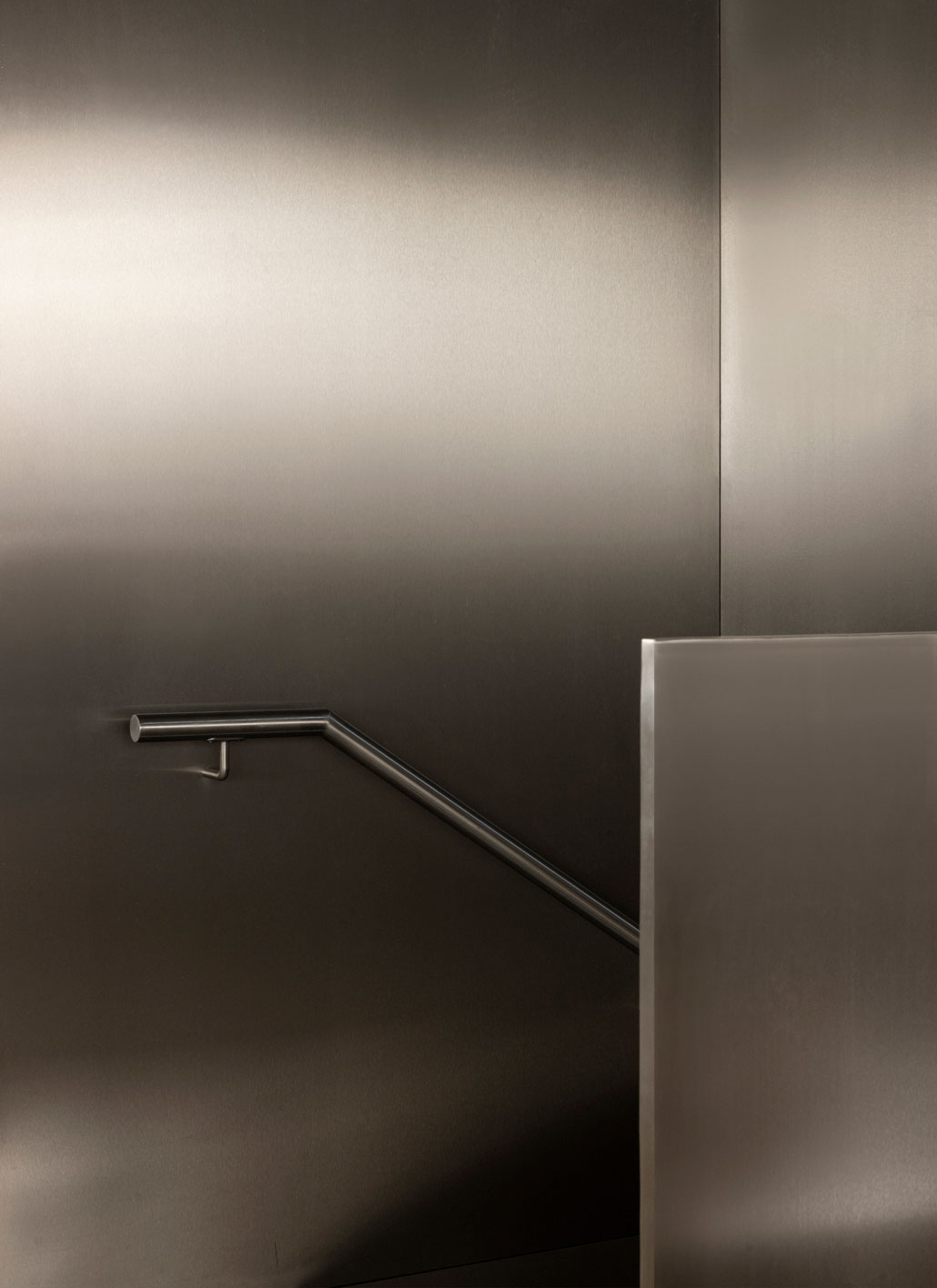
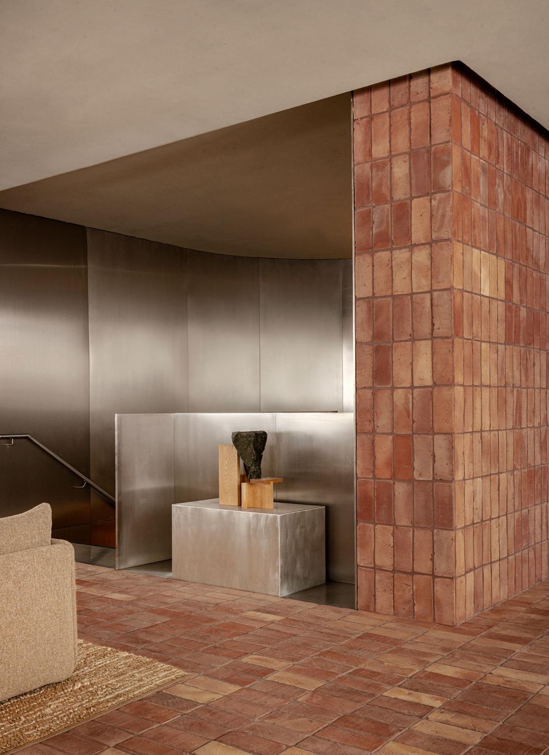
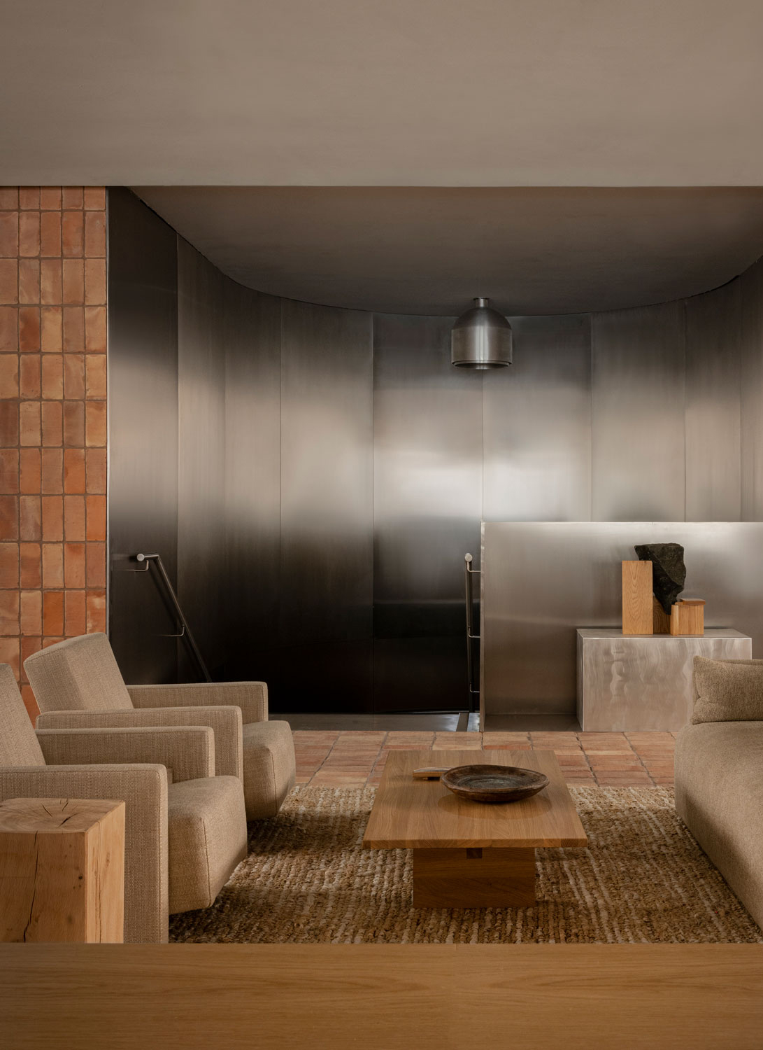
With features of the existing facade like red brick, sandstone, and concrete, we pay tribute to the architectural legacy while implementing brushed and polished stainless steel as an homage to the allure of the London Silver Vaults – a subterranean market dating back to the 19th century that is nestled just below the Chancery House.
“
The essence of designing for well-being lies not in grandiose expressions or ostentatious features but in cultivating a harmonious environment. To achieve this, we’ve harnessed the power of natural forms, materials, and colors to construct spaces that not only look and feel good but also stand the test of time.
This ethos is exemplified in the thoughtful provision of amenities, ranging from an organic restaurant to high-quality end-of-trip facilities. Additionally, we’ve challenged the status quo by infusing spaces like the gym, yoga studio, and communal meeting areas with natural daylight, views of green spaces, and invigorating fresh air – elements often relegated to dimly lit basements. This deliberate attention to detail reflects our unwavering commitment to taking wellness seriously and transforming the workspace into a realm where people can thrive holistically. Thus, our collective efforts have been dedicated to infusing well-being into every nook and cranny, seamlessly bridging the gap between exterior and interior. Whether it’s a dedicated wellness area or a simple meeting room, our pursuit has been guided by the central theme of balance – a nuanced and comfortable equilibrium that engages all the senses without resorting to flashy or overly dramatic design.
We believe that the essence of designing for well-being lies not in grandiose expressions or ostentatious features but in cultivating a harmonious environment. To achieve this, we’ve harnessed the power of natural forms, materials, and colors to construct spaces that not only look and feel good but also stand the test of time. The result is a curated interior akin to a mesmerizing miniature painting of the urban context, allowing you to feel the character of the neighborhood without having even left the house. Each brushstroke of design and every carefully chosen element come together to create a workspace that caters to a plethora of needs – be they functional as well as aesthetic, while embodying a harmony between design and environmental responsibility.
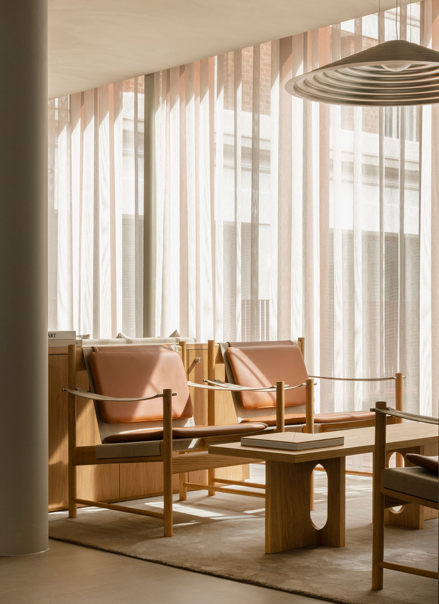
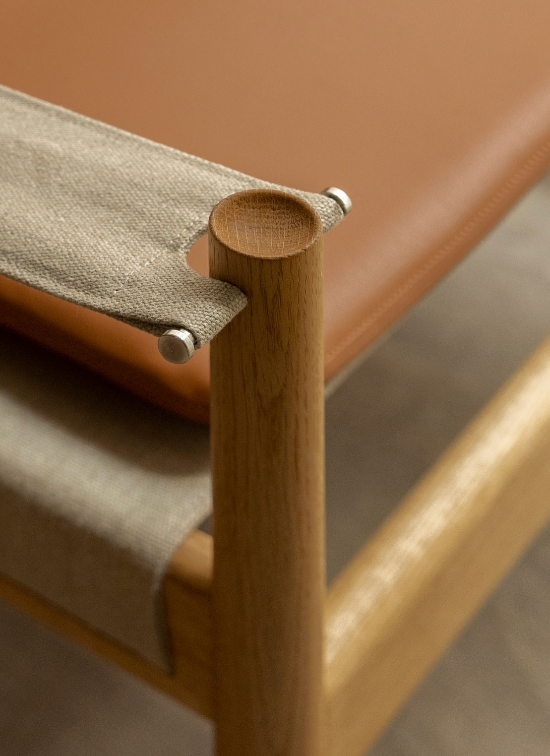
The interplay of soft and hard materials, like the fusion of textiles and bricks, creates a space that not only stimulates the user but also radiates a welcoming warmth, essential for both work and relaxation within the confines of the space.

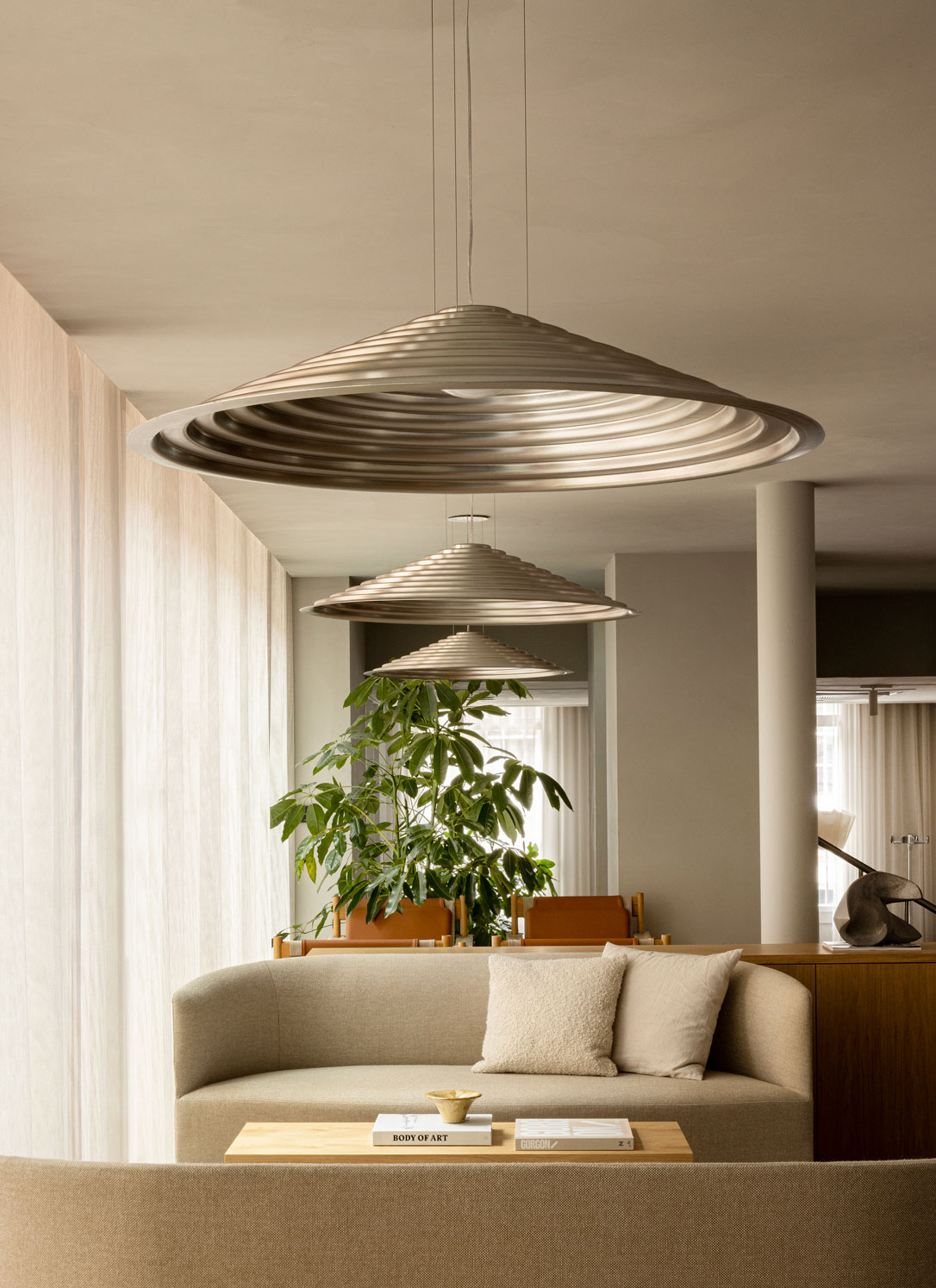
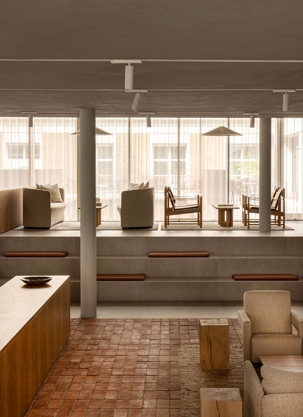

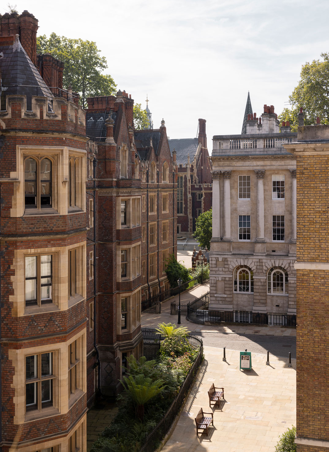
Drawing from the essence of the building, the vision was to create a space that not only respected the area’s character but also embodied its spirit – a hub grounded in its context, connecting with the community it served.
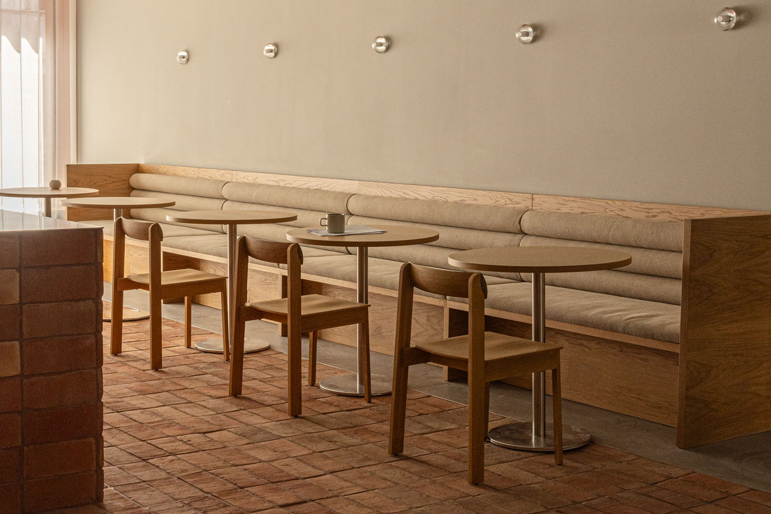
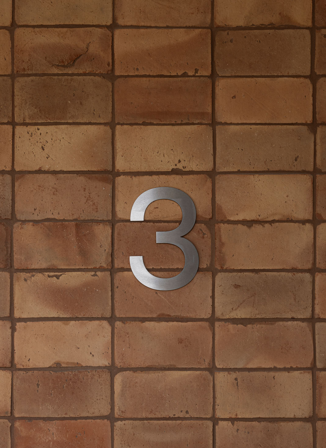
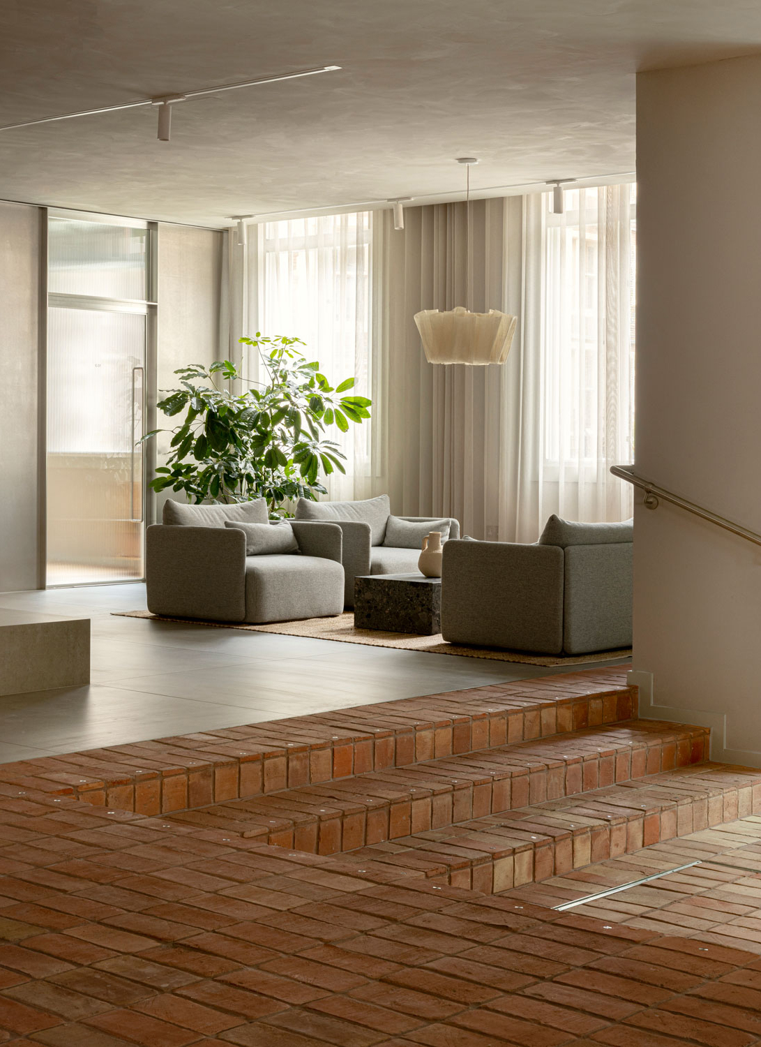
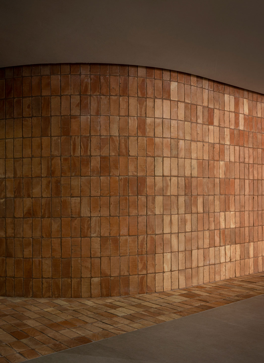
On the ground floor, you’ll enter a striking reception area with a homey feel and a tactile materiality. The essence of the exterior seems to have seamlessly transcended into the interior – a symbiosis where the red bricks of the building gracefully extend inward, becoming an integral part of the space as they form steps, floors, and walls.
It is in the reception area where our idea for the building really comes together full force with its curated elements and materials, resulting in a sense of comfort and grounding in the local context. All situated between the courtyards bringing in greenery and an abundance of natural light, we carefully blend the indoors with the outdoors, while timber screens and comfortable seating create relaxed zones for working, connecting, and enjoying. Here, we show our take on designing for well-being; it isn’t about maximum expression and dramatic design features, it is about creating a comfortable balance in the interiors that speak to all our senses.
“
The character of the entire neighborhood is reflected, repeated, and contrasted in our vision for the Chancery House in a contemporary way that connects inside and outside symbolically, while providing a tactile and natural warmth.
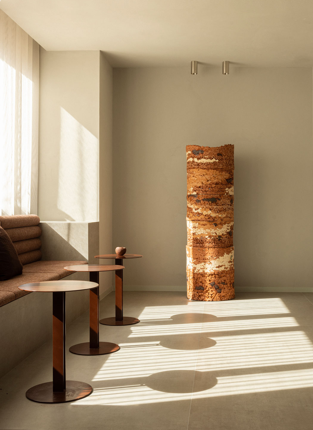

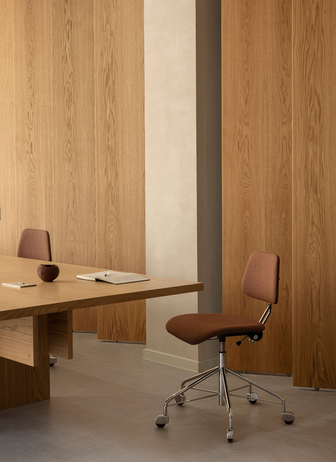
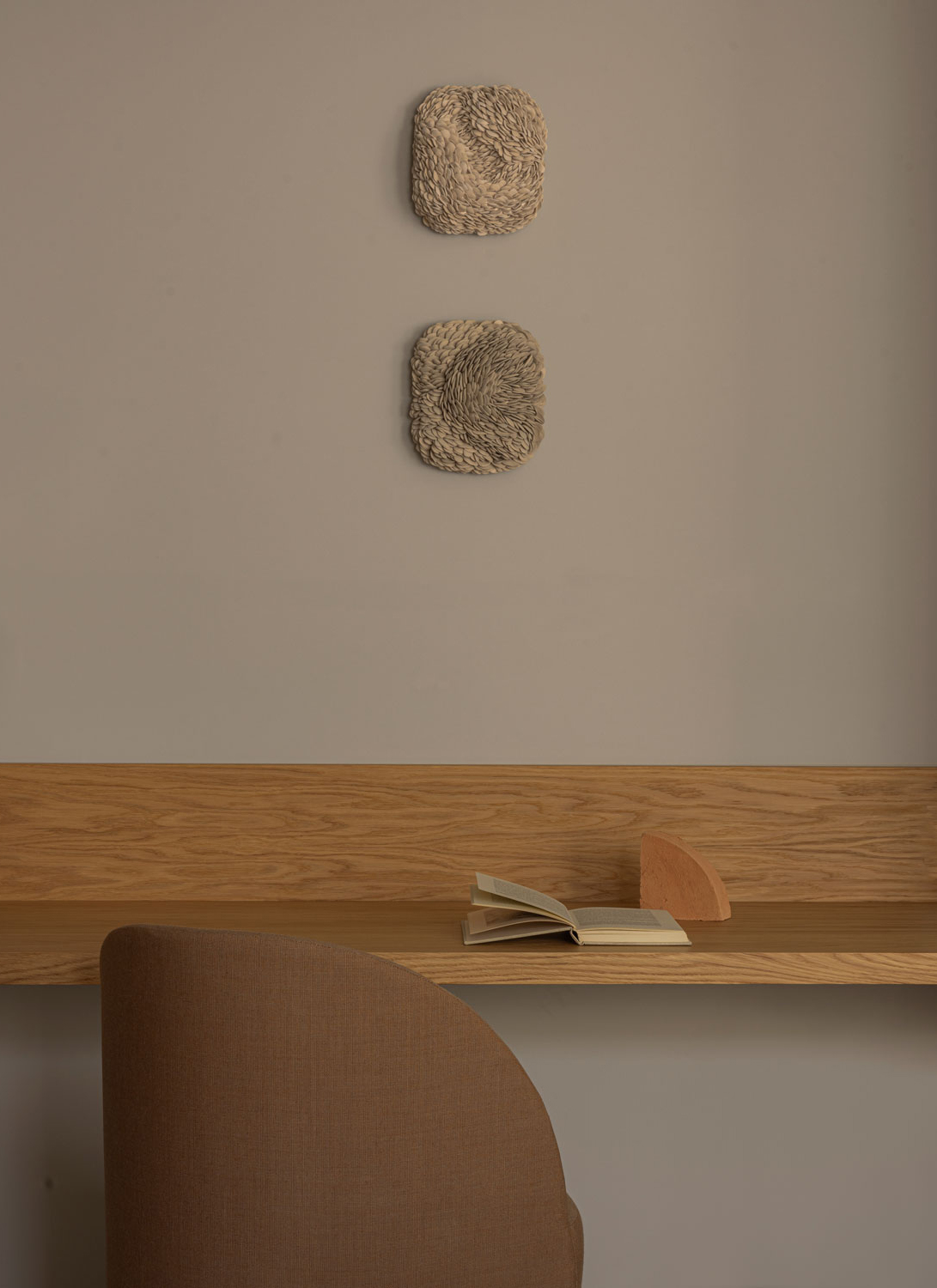
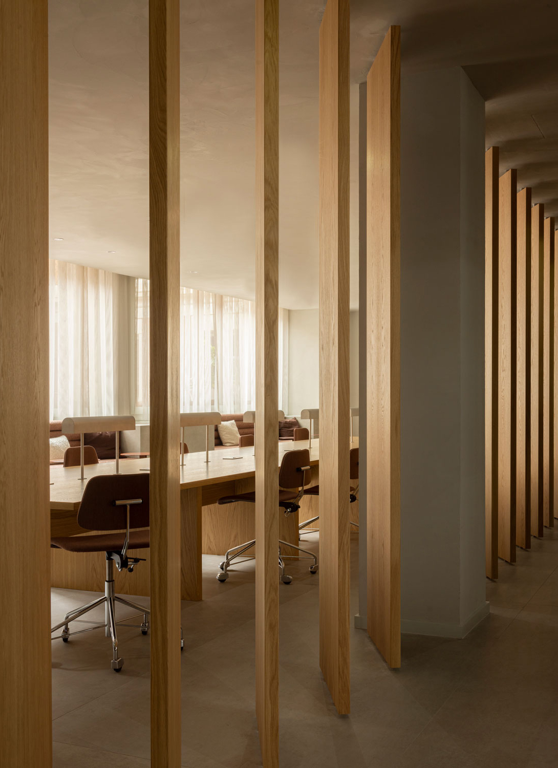
Wooden screen walls, strategically placed around a common working area on the ground floor, lend a warm and inviting atmosphere, creating a sense of enclosure without sacrificing the open, communal spirit of the space. Comfortable office chairs, designed by Norm Architects for Labofa, encircle the long communal table that stretches across the room, forming an environment where comfort meets productivity.
As individuals gather around the table to brainstorm, ideate, or simply work in peace, the space provides the perfect setting to support their endeavors in style and convenience. It’s a place where ideas flow freely, and where comfort and function blend together.

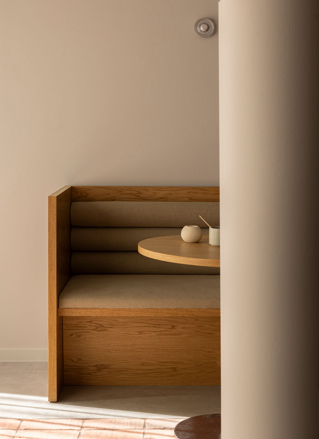
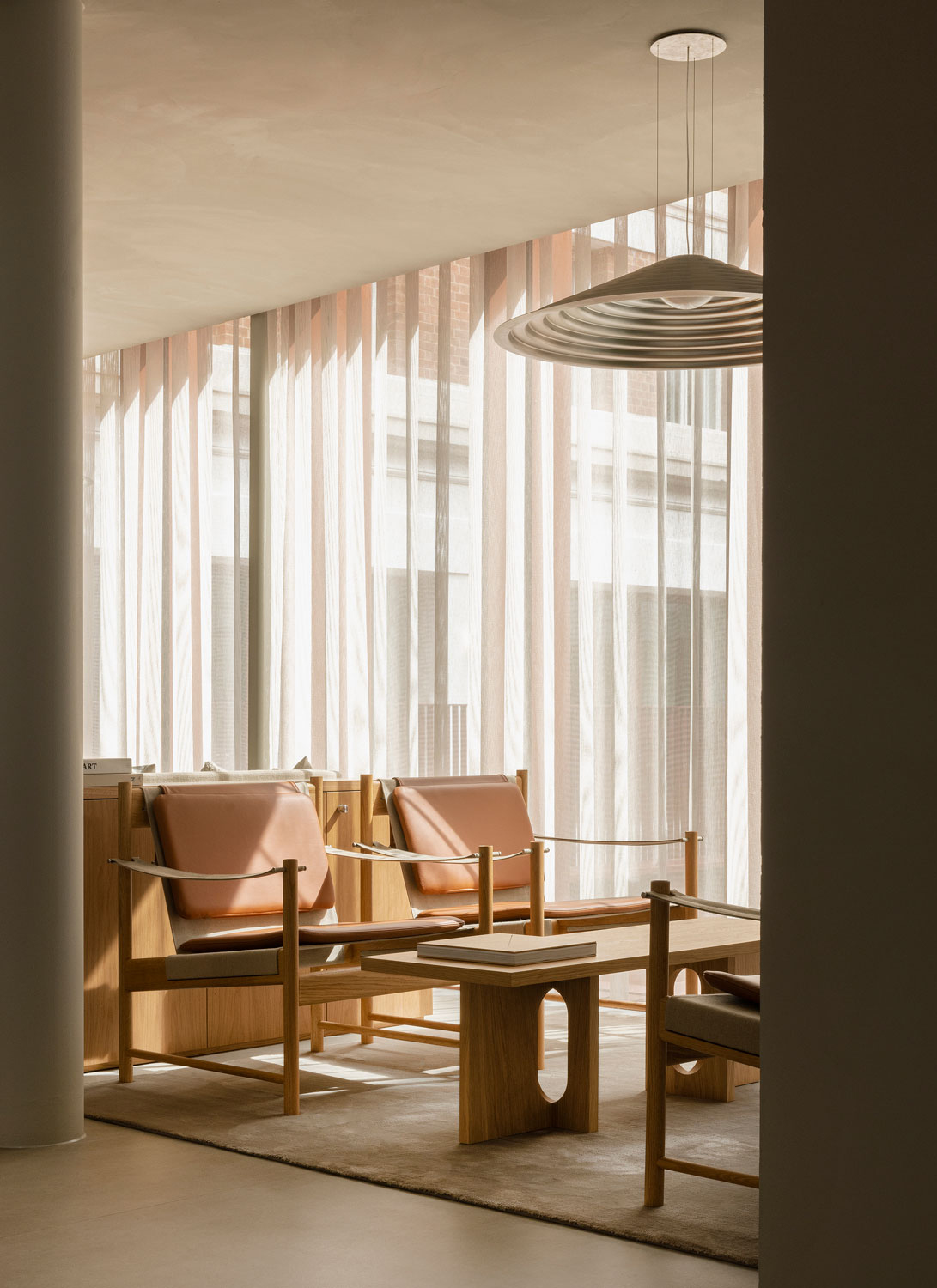
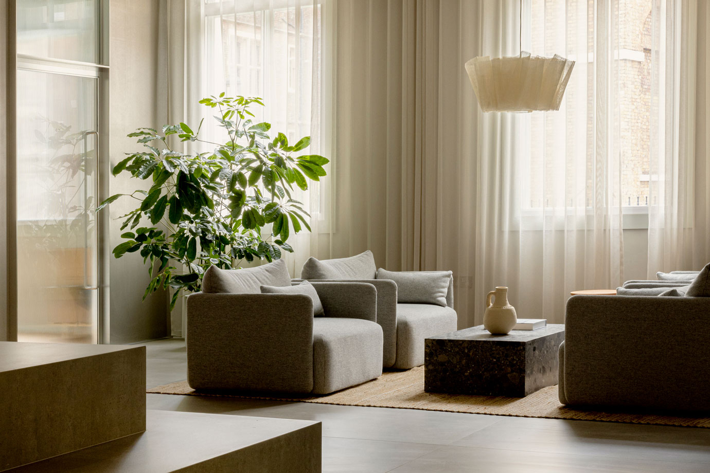
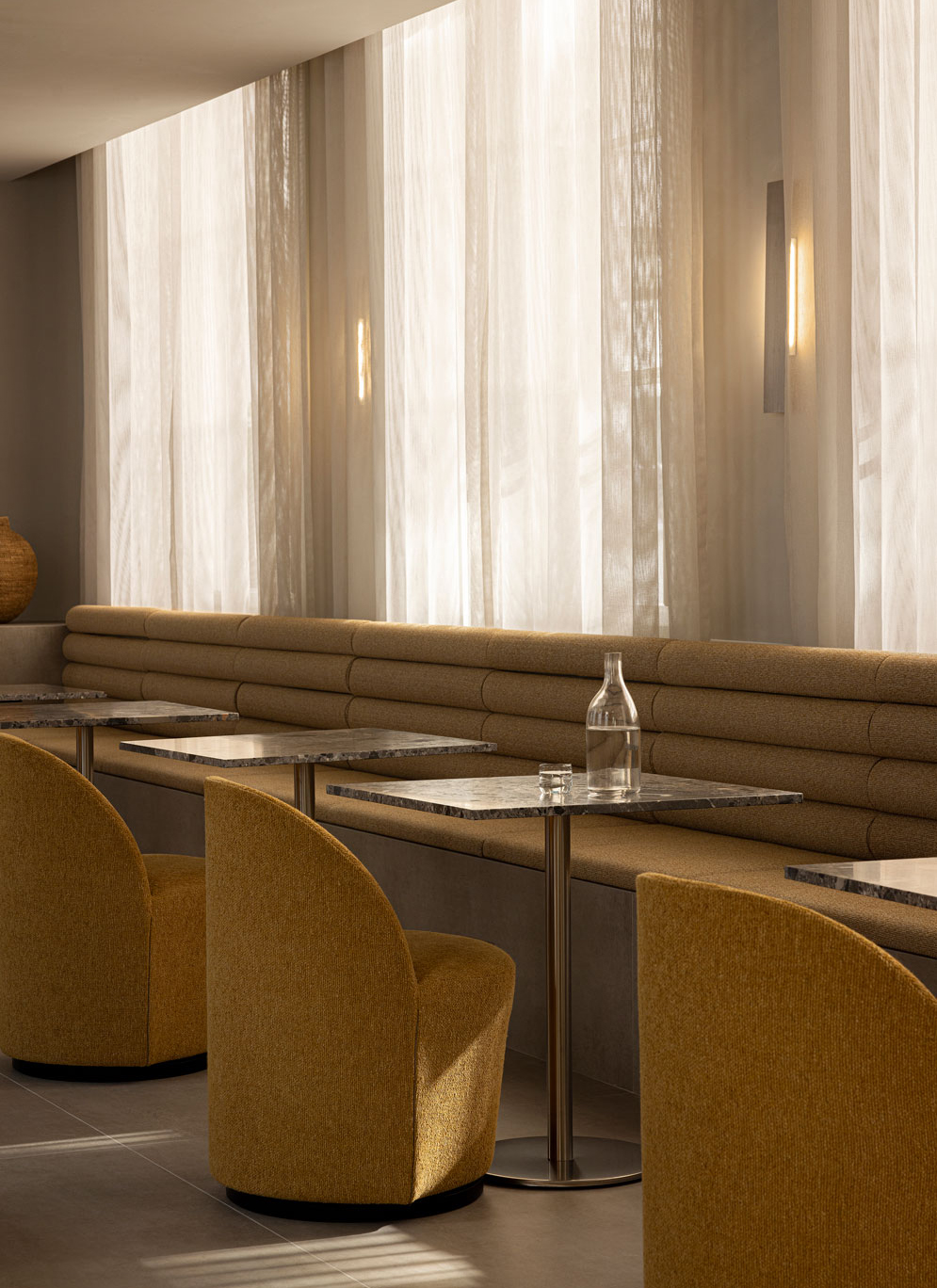
Comfortable seating arrangements are scattered around the ground floor, encouraging a relaxed and communal environment that supports work, connections, and moments of leisure. These zones are designed to accommodate both focused work sessions and casual interactions, fostering a sense of balance and adaptability within the workspace which is at the heart of The Office Group’s raison d’etre.
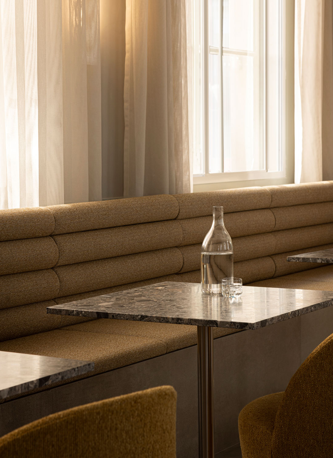
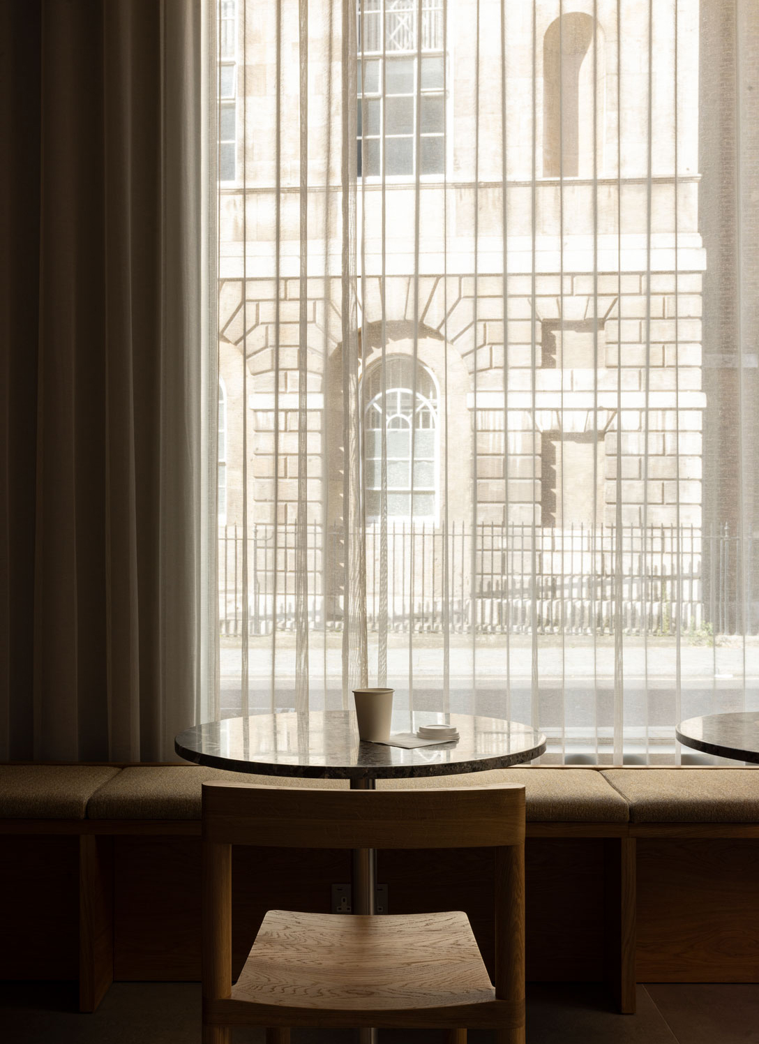
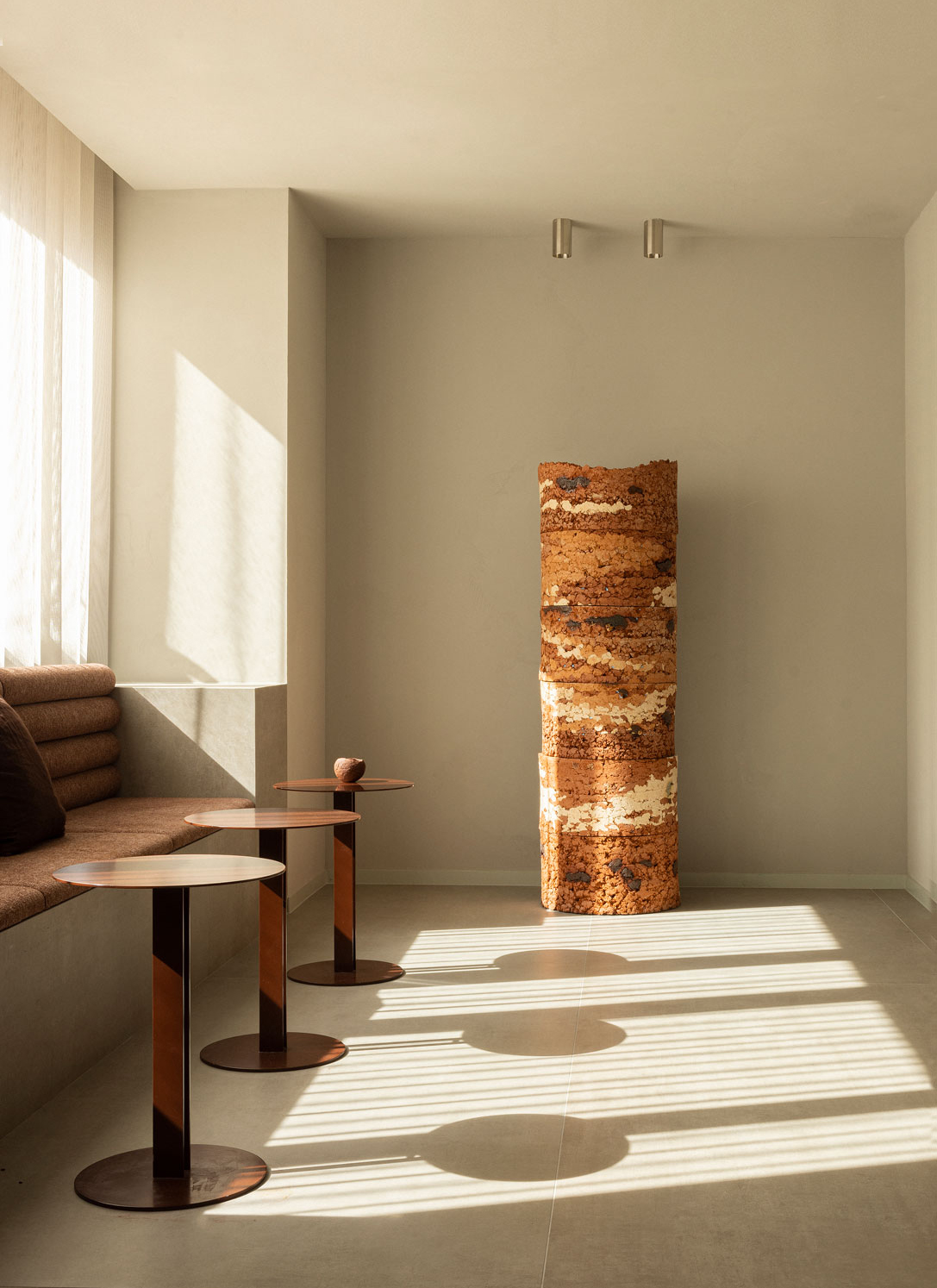
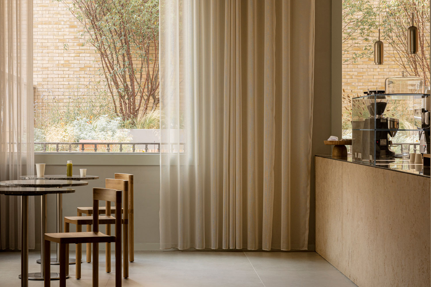
Nestled within the heart of the bustling city, the cafe embodies tranquility and well-being in every sip of quality coffee and every bite of organic food. Windows frame the calm view of the courtyard as well as the London streetscape, while the sandstone counter, bathed in the soft light streaming in, echoes the very facade you can glimpse just beyond the glass.
Recognizing that the world of work has changed since the building’s last incarnation, Chancery House has been consciously developed to deliver real choice in how and where people spend time in the workplace.
A vibrant and welcoming cafe beckons to employees, offering a respite from the demands of the workday. Bathed in the gentle embrace of natural light, the ambiance within is a testament to meticulous design and material choices. The color palette has been carefully selected to mirror the hues and textures of the surrounding cityscape. Soft, earthy tones, create an organic connection between the cafe and the vibrant energy of the city just beyond its windows. Whether in need of a quick coffee, a quiet corner to catch up on emails, or a communal table to exchange ideas, the ground floor cafe caters to all. It’s a place where the city’s vitality finds its way indoors.
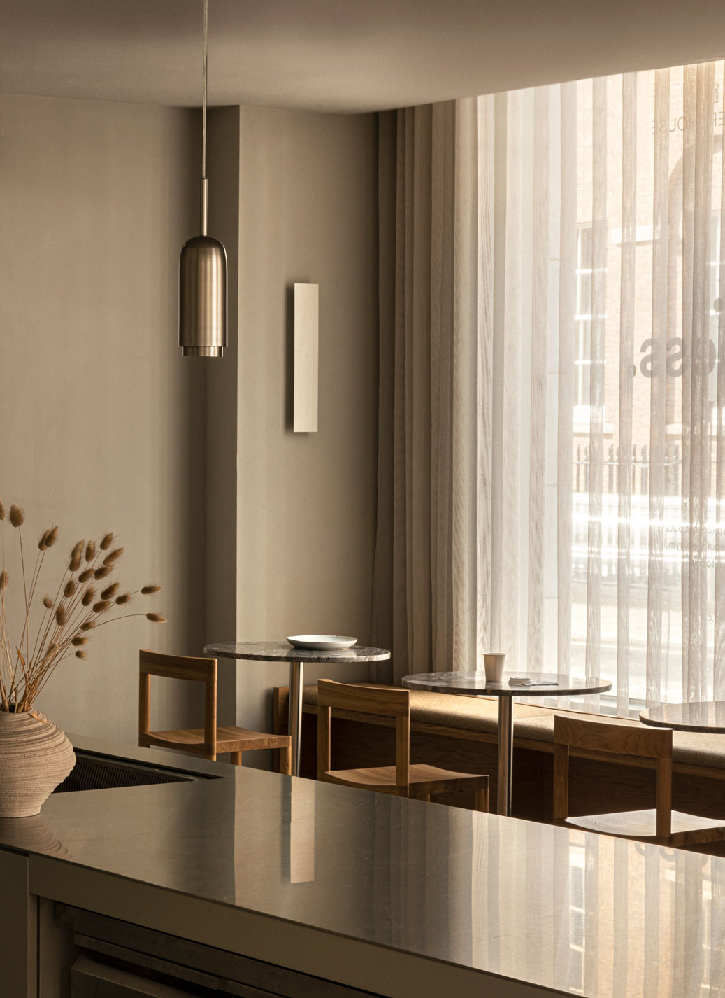


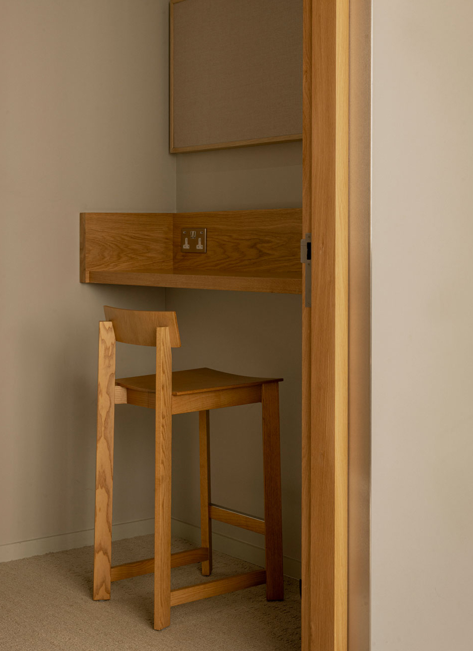
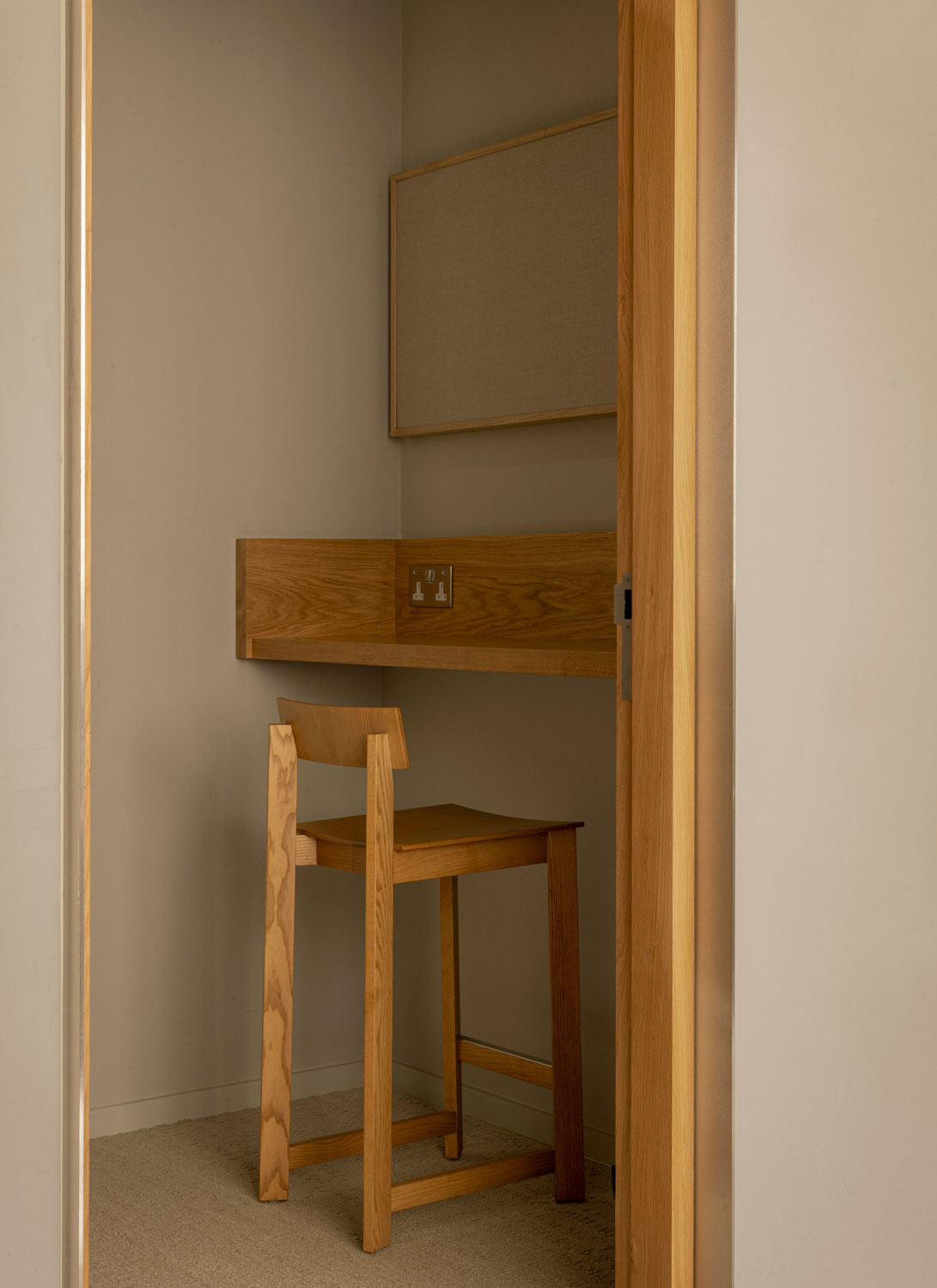
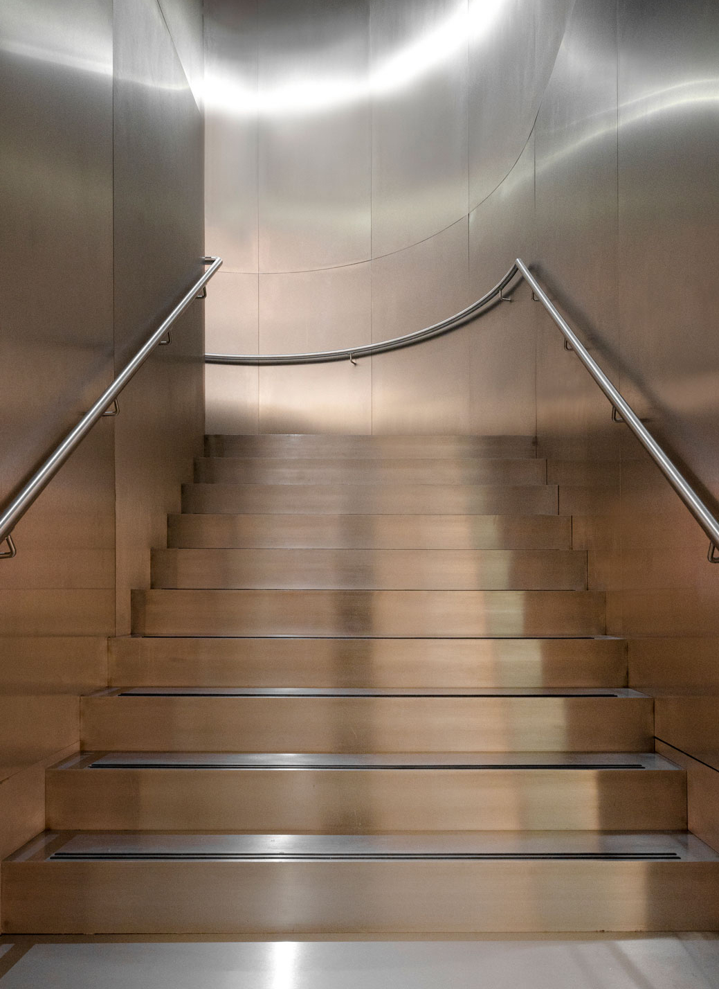
Descending a magnificent steel staircase, people are led downstairs, embarking on a symbolic journey into the historic Silver Vaults. Shifting from the red hues of the levels above, the bricks used on the floor transition to a more golden tone, signifying a shift in the ambiance and purpose of the space. At the heart of this new setting, an enormous co-working table takes up the space, making a bold statement about the spaciousness and collaborative spirit of the area. It calls for individuals to come together, share ideas, and forge new connections. Yet, this place offers much more than just a communal workspace. You’ll discover secluded nooks thoughtfully designed for immersion and quiet conversation, providing a place for those who seek focus, contemplation, or intimate discussions.
Moreover, the space is a testament to The Office Group’s holistic approach to well-being. An impeccably equipped gym invites individuals to maintain their physical health, a wellness area beckons for relaxation and rejuvenation, and a serene yoga studio offers a tranquil space for finding inner balance. In these symbolic ‘silver vaults’, employees find themselves immersed in a space that honors productivity, serenity, and community.
Comfortable seating arrangements are scattered around the ground floor, encouraging a relaxed and communal environment that supports work, connections, and moments of leisure. These zones are designed to accommodate both focused work sessions and casual interactions, fostering a sense of balance and adaptability within the workspace which is at the heart of The Office Group’s raison d’etre.


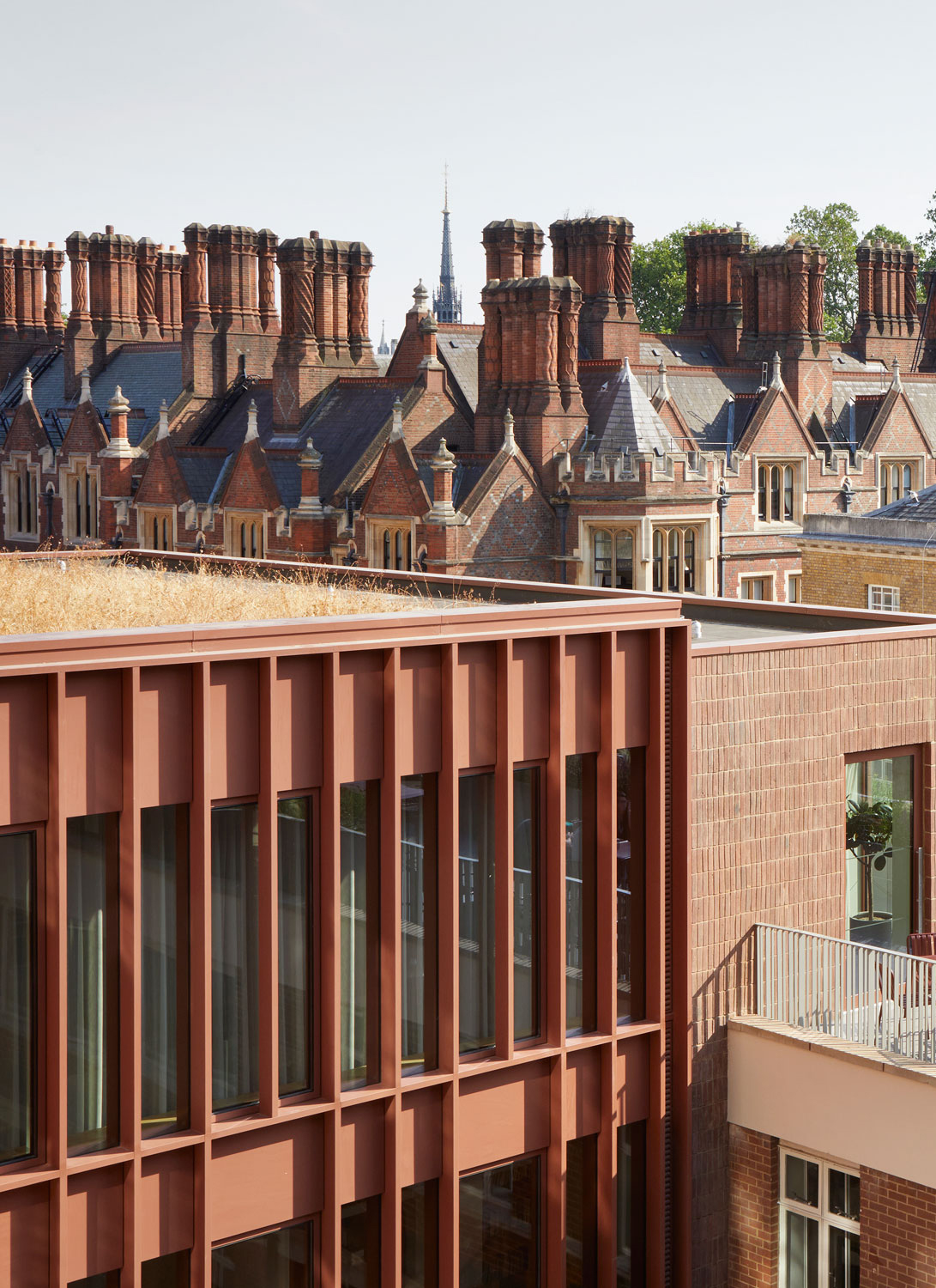
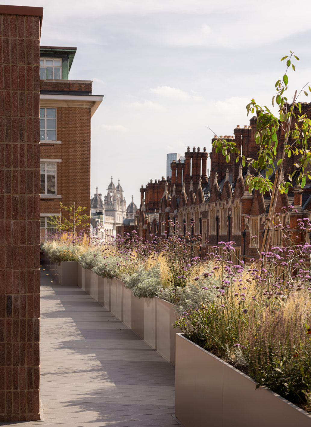
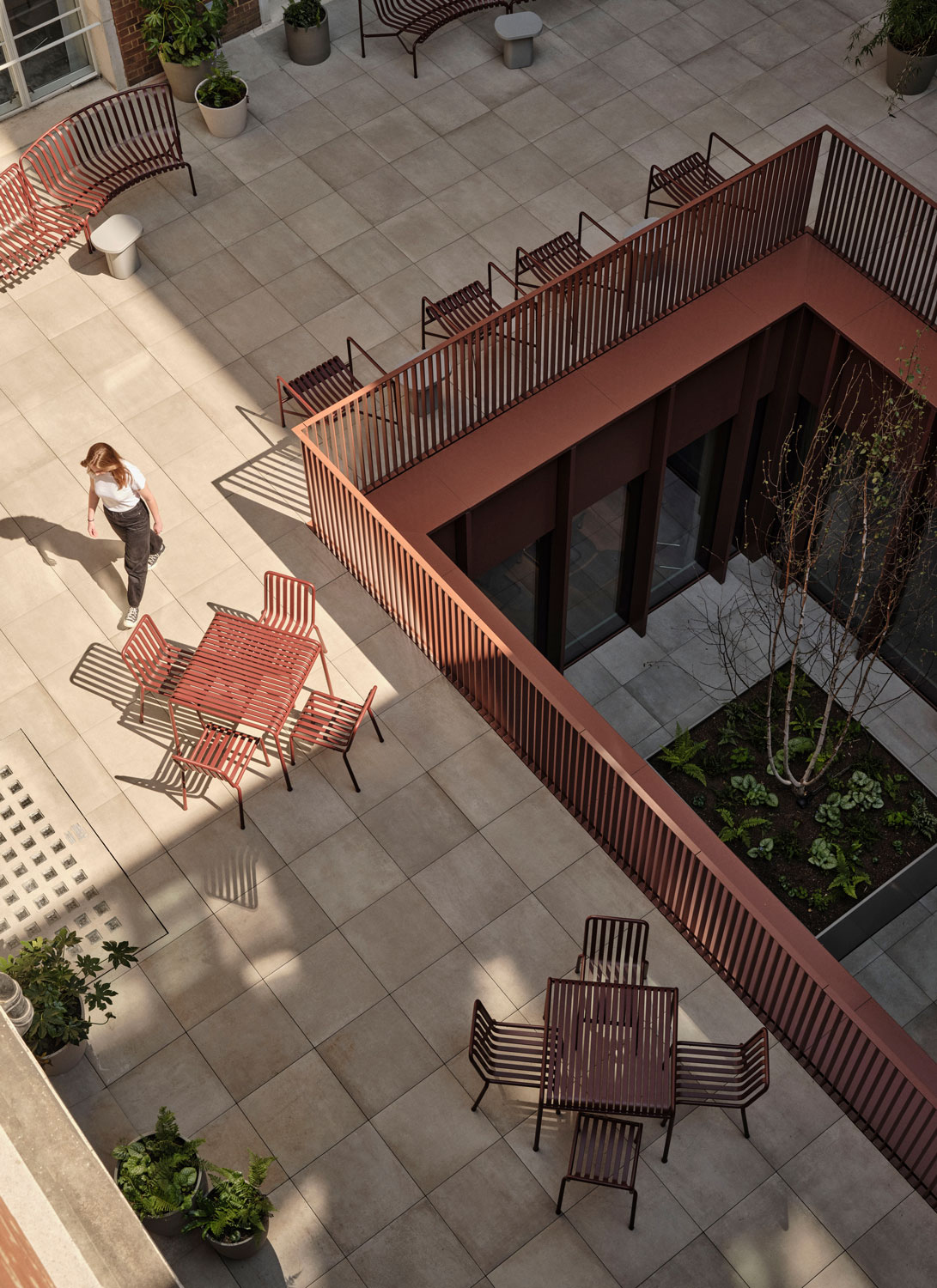
Looking down towards the building, you’ll see how dMFK Architect’s reconfiguration of the building has secured open-air terraces on several levels to ensure that there’s always somewhere alfresco to retreat to for a mind-refreshing change of scene – while also providing an abundance of natural daylight inside.
Wellness and well-being in the workplace have become paramount in today’s fast-paced, demanding world. More than just buzzwords, they represent a fundamental shift in how we approach work and life. The Office Group knows that a focus on wellness at work extends far beyond ergonomic chairs and standing desks. It encompasses the physical, mental, and emotional health of employees as well. At the Chancery House, we’ve therefore created spaces to disconnect, get the heart rate up in a workout or slow down and breathe deeply at a yoga class.
Incorporating wellness initiatives into the workplace is an investment that pays dividends. Hence, a nurturing and inclusive workplace, where employees feel supported in their overall wellbeing will be more engaged, healthier, and more resilient. With this in mind, we worked to create minimalist designs that whisper rather than shout, spaces with understated warmth and intimacy created through tactility and a balancing of light and dark as well as a less-is-more approach to colours, textures and shapes – accessible, simple and easy to use.
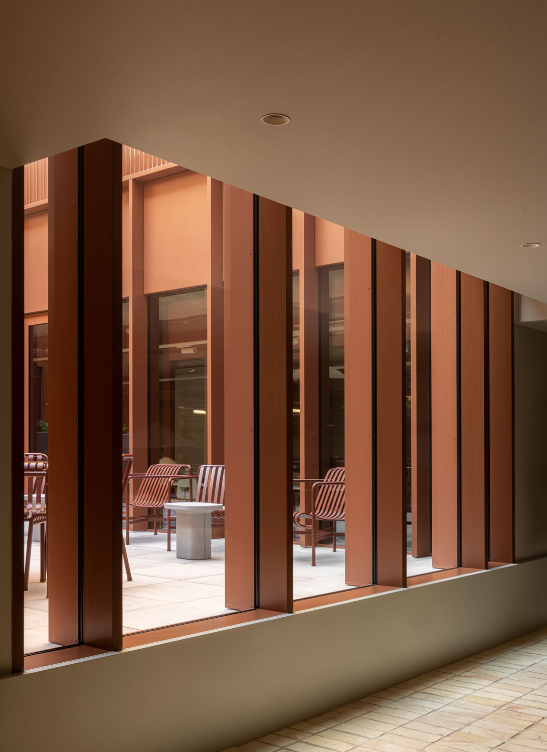
Making the most of dMFK Architects’ brilliant move to extend the lightwells into the basement, it was possible for us to design the gym with daylight, fresh air, views to greenery and the levels above. Our extensive use of timber for flooring and joinery paired with sheer curtains and light grey tones has given the space a lightness and warmth which is more akin to that of yoga retreats than regular gyms.
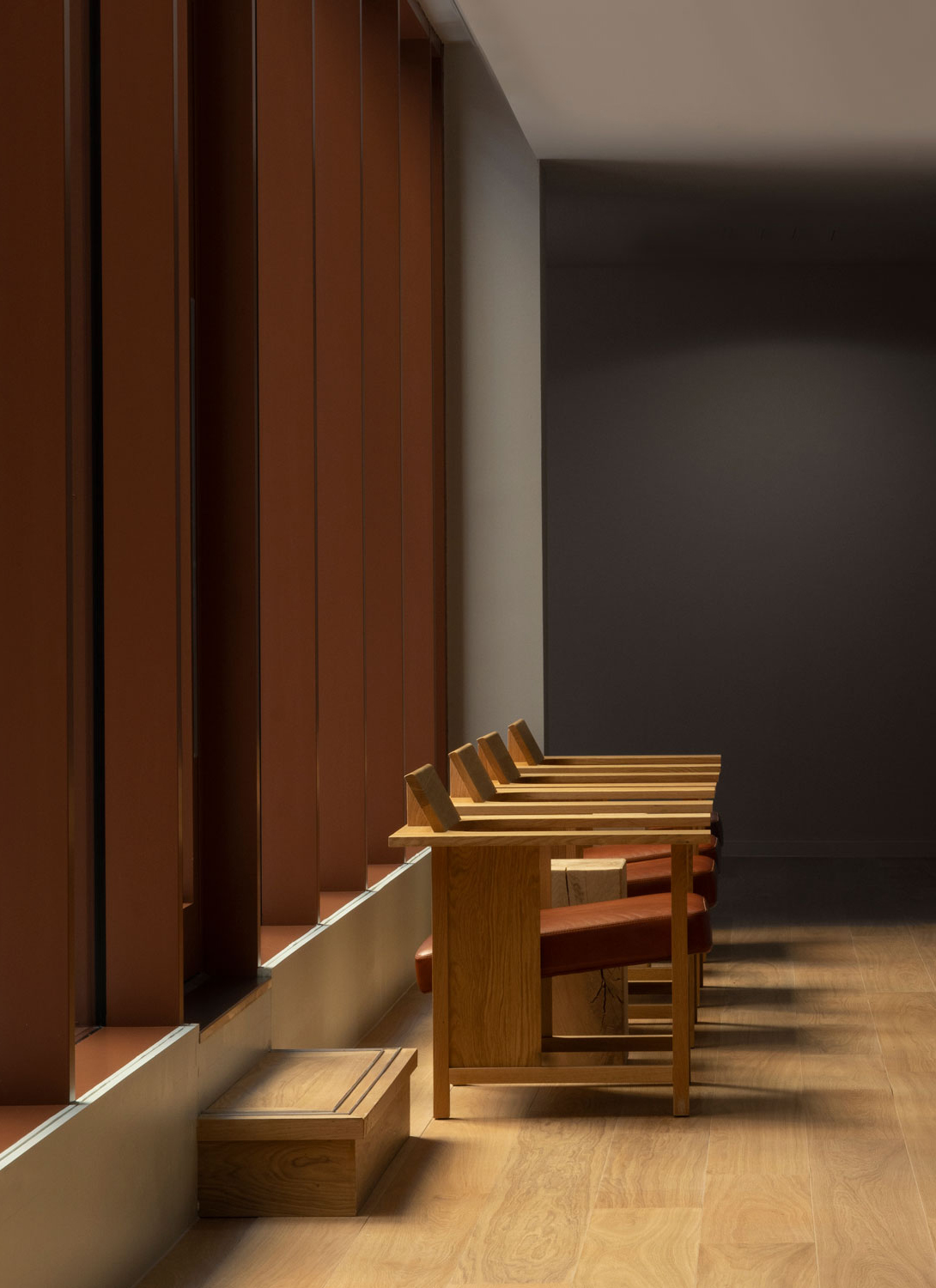
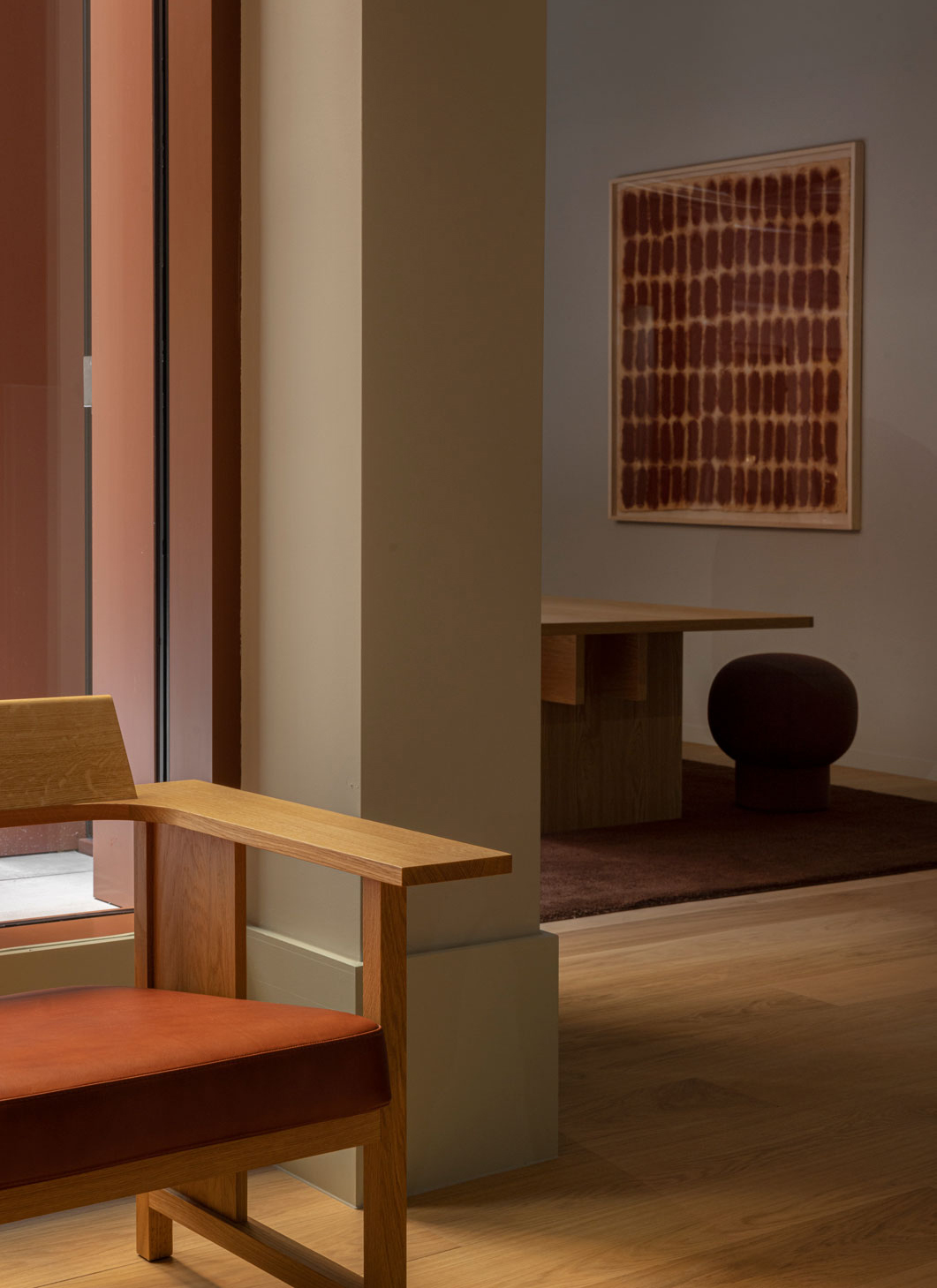
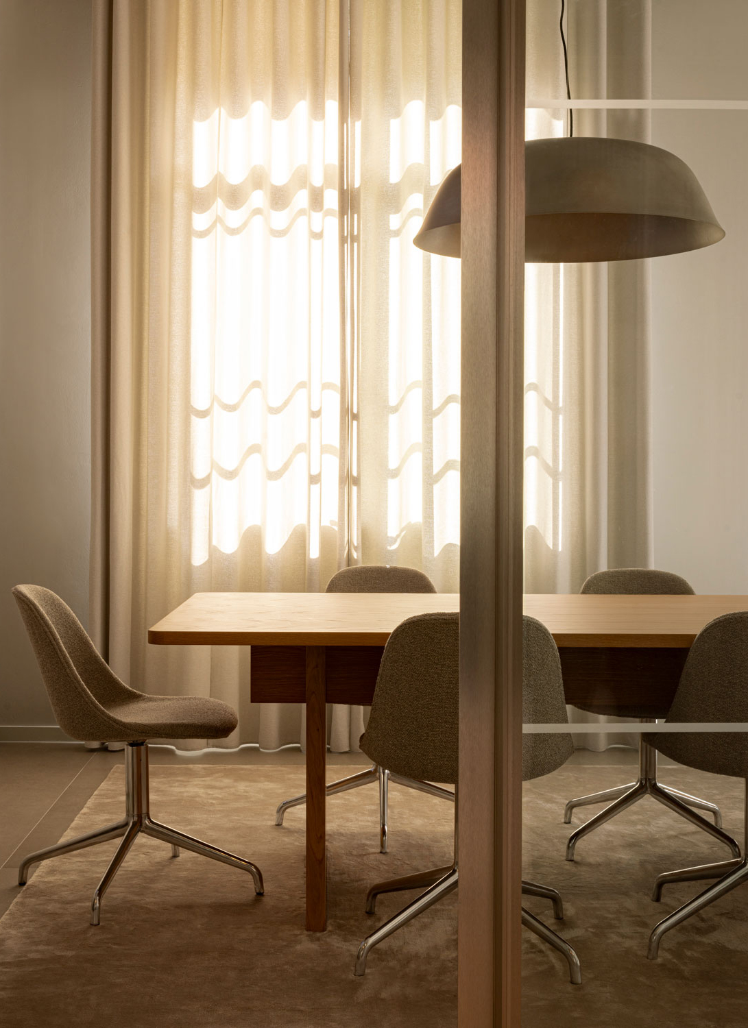
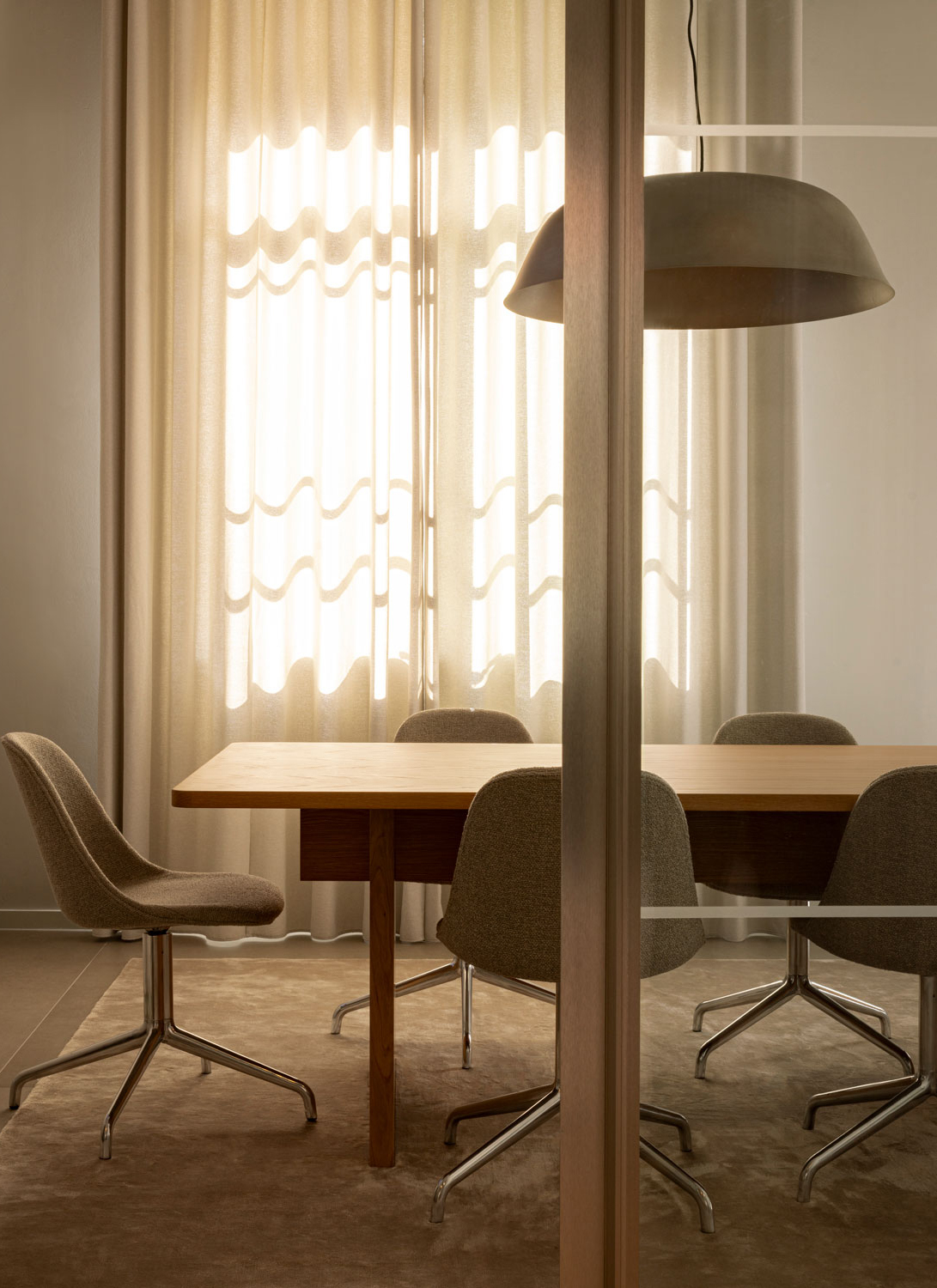
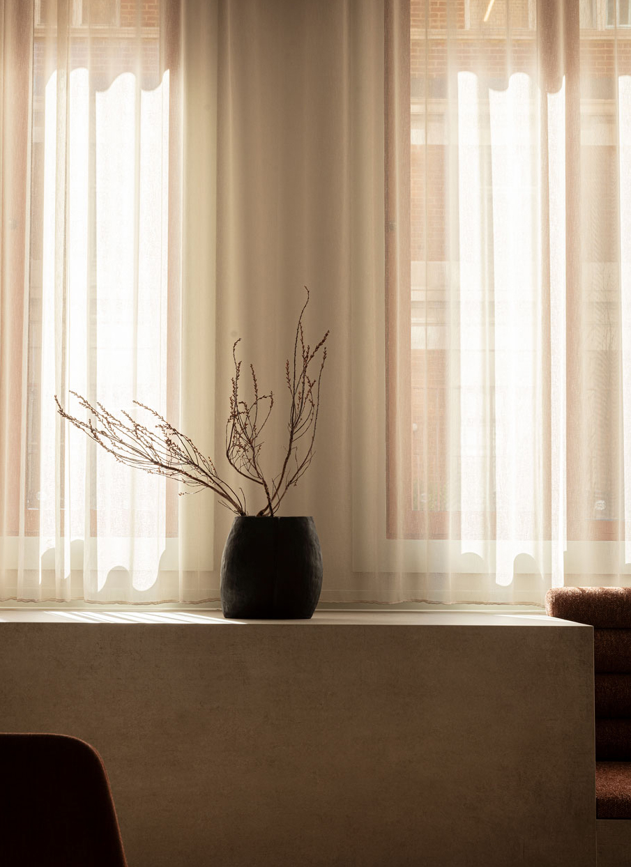
Spread across most floors, you’ll find meeting rooms of different character and size. These are all places for important decisions to be made, ideas to be shared, and collaborations to be strengthened. Moreover, having a quiet environment with minimal distractions helps the team focus and be more productive. Light curtains and lush carpets aren’t just decorative, they help frame the interior while improving the acoustics, which is ever more important today where people tap into meetings from all over the world.
A great deal of care was taken to size and position spaces correctly, to break down the scale, and to offer a huge range of workspace options so that users are constantly able to change the way they work, or to find a particular space that suits them.

